What Is The Color Wheel And Why Is It Important
How to use the colour wheel in art, in simple terms whilst still being of practical use. There are literally millions of colors as any computer user will tell you but we only need to understand a few of them, and how the colour wheel can help with this, to realise how they can be used together for real benefit to the artist, adding a creative dimension to paintings and other artworks.
The colour wheel only considers three primary colors, three secondary colors and six tertiary colors and we look at how the color wheel is arrived at and how it is used.
The accompanying image is for explanation only and does not represent the actual colours. I put this together in Photoplus and could not obtain the exact colours, the images throughout are taken from this diagram. This should not affect the explanation here.
This will give us a practical ability to select color schemes for our art. For an artist / designer, knowing how to make use of the color wheel makes choosing color schemes and why they work, easy.
This is a concept that beginners sometimes find difficult to grasp at first. However it is very easy and will pay dividends if you understand how to use it to select color schemes for your artwork.
The Color Wheel 101
A Primer
The first thing to understand is that there are three colours from which all others can be mixed. These are called the PRIMARY COLOURS and there are specific names for them but all you really need to know is that they are red, yellow and blue. Please note: I have created the colour wheel images on this page for the purposes of this explanation of the concept, they do not accurately reflect the true primaries or mixes of these.
Photobucket
Mixing these in more or less equal proportion gives another three colours called SECONDARY COLOURS. They are green (blue and yellow), violet (red and blue) and orange (red and yellow).
Photobucket
TERTIARY COLOURS are obtained by mixing a secondary colour with an adjacent primary. E.g. red and orange gives red-orange, blue and violet gives blue-violet.
Photobucket
The real beauty of the colour wheel is not that it provides a colourful diagram, but that it helps to select colour schemes for your artwork and here’s how it fits together
Photobucket
Now we shall consider how we might use this knowledge. But first of all, the colours on the screen do not seem to work too well especially in the red to blue sector. Why not use the paints / colours from your own palette to make a colour wheel? Use it for reference when needed, it will repay the effort many times over. Just start with the primaries and add the other sectors by mixing the colours in the respective proportions. In fact, if you use different primaries ( for example: alizarin crimson in one wheel and cadmium red in another) you will be able to see which colours when mixed give you vibrant greens or dazzling oranges, etc. Knowing how to use your colours is one sign of a good artist.
You can find out more about the primaries I use in my watercolour palette, and how I use them to mix secondaries, etc in my page on Painting The Seasons.
The Monochromatic Colour Scheme
Use Of The Colour Wheel (1)
We can identify five main colour schemes based on their relative positions in the colour wheel. The first and easiest of these is: –
THE MONOCHROMATIC COLOUR SCHEME; contrasts are achieved simply with shades and tints of any one colour.
Now we seem to have introduced the concept of shades and tints. Do not fret! A tint is a lighter version of the colour. It is made by a process which depends on the media being used. In oils or acrylics for instance, it would be a mixture of the pure colour pigment and white. In watercolour, it would be a more dilute mixture of the colour. A shade is a darker version of the colour, often made by mixing with black but could be achieved by mixing in a small amount of the complementary colour. More about this below.
The Complementary Colour Scheme
Use Of The Colour Wheel (2)
The next we shall consider is the complementary colour scheme. Here we make use of one main colour and its close neighbours on the colour wheel or their tints and shades, and add a little zing by also using its complementary colour. This is the colour found opposite on the colour wheel. So :-
for blue the complementary is orange
for red the complementary is green
for yellow the complementary is purple
The photo of the indian lady shows a collage which makes use of a complementary scheme to make the red sash stand out.
Another collage, I have recently completed shows the effect of using a blue colour scheme and adding a little orange in the form of images in a film strip. I think this shows how effective the complementary colour scheme can be.
The Harmonious Colour Scheme
Use Of The Colour Wheel (3)
Next we shall consider the Harmonious colour schem, also called the analogous colour scheme.
This utilises closely co-ordinating colours, i.e. close together on the colour wheel. This is often described as using either warm or cool colours. Warm colours are the reds, yellows, oranges and their mixtures. Cool colours are the blues and greens.
The “sixties” themed ATC shown here uses mainly reds, purples and oranges to give it a warm feel.
Another example is given which uses cool blues in various tints.
The Triadic Colour Scheme
Use Of The Colour Wheel (4)
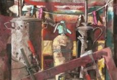
The triadic colour scheme utilises colours equidistant from each other on the colour wheel. E.g. red-orange, blue-green and blue violet. An example of this is seen in this “african themed” ATC.
This second photo shows also shows a triadic colour scheme in use. The red background with the blue of the repeated advertisements and the yellow text and gold (yellow) colouring dragged across the background.
The Split Complementary Colour Scheme
Use Of The Colour Wheel (5)
painting over collageThe split complementary colour scheme uses one dominant colour balanced by two colours from either side of its complementary. This can be said to be very similar to the triadic scheme and only subtly different.
The example here shows a painting, as I have not been able to find one of my ATC’s that have been created using this colour scheme.
The dominant blue has been off-set with a reddish orange and touches of a yellowish orange.