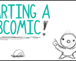
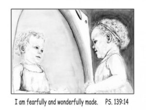
What is good drawing? How to make a difference

What is good drawing? How to make a difference

Good drawing – better drawing , how to make a difference

What is good drawing is a question that I was confronted with on my first day in school. The answer I got to that question changed a lot in my life for quite some time. The dimensions of this seemingly innocent question are much wider than one would assume on first sight.

But this question is not put up here to stage a controversy or to seek late revenge for an early injury by a stupid teacher. Rather I want to use it to arouse interest in the many facets of drawing. The question what is good drawing forces to analysis and development of criteria which allow to make a difference in quality between drawings. As a result this process will lead not only to better understanding, but also to enhanced enjoyment of drawings.

At this point it might be clear that this site is not about construction or instruction drawings, but about drawing in arts and in particular about the artistic value of drawings.

How to analyse a drawing

The analysis of a drawing often consists in separating certain aspects of a drawing. Usually it starts with the level of technical skill that the artist shows. As second aspect the content or the picture idea is examined further and finally the artistic value might be considered.
Such an approach is not without difficulty, because it is impossible to separate these three aspects from each other as their combination is what makes for the quality of a drawing. The use of simple lines might indicate a lack of technical skill, but in fact simple lines might be used with purpose as a means of artistic expression for example.

However this method is still a good way to explore drawings and therefore I want to discuss these three different layers of a drawing further.

Craft and dexterity – technical skills and quality of a drawing

What are drawing skills ?

Postcard Forest diary ink drawing postcard

I remember the tale of an artist and his king in China. The king commissioned a drawing of a cockerel to a famous artists and the artists agreed. After waiting one year as the works was still not finished the King got impatient and started to send out messengers to the artists cabin a long way in the woods.
They returned and reported that the drawing was not done yet. This happened a couple of times until the King got so angry in the 10th year of waiting that he made the journey himself ready to punish the artist on site, if he had not finished the work yet.

In the cabin the king urged the artist to do the drawing otherwise he would be killed. The artist replied that the king just came on time as he was ready no to do the drawing. He fetched a piece of beautiful rice paper, prepared the ink and laid down the drawing with his brush within a few minutes. The king was totally amazed and pleased with the quality of the work, which was a perfect piece of art and a beautiful representation of a cockerel.

The king asked the artist, why for heaven sake didn’t you do this quick drawing already ten years ago? The artist said nothing but turned to his big wall cupboard to open the doors. As the doors opened hundreds and hundreds of drawings fell to the floor, documenting that the artist had done nothing but drawing cockerels over the years until he thought that his skills were good enough. The King was ashamed and fell silent.

The most realistic or illusionistic representation in a drawing is often seen as the ultimate proof of quality in a drawing. The more a drawing conjures with a photographic image the better the quality it seems. Indeed it takes very long and talent is needed to achieve skills that enables the artist to depict a subject in aphoto realistic way.

Training of drawing skills was a major task of art academies during centuries. These academic skills were abandoned in modern art not because artist were too lazy to do the exercises, but the value of academic drawing was questioned by modern artists. Pure imitation no matter how skillful it is conducted seemed to be without artistic value.

These are two main position that have been discussed in art for a long time and it seems there is no end to this. I think that there cannot be an end or a final valid judgement on these issues. The interesting thing is the discussion itself, the different views on drawing which open new perspectives for the participants in this discussion.

Content , image idea, meaning of a drawing

Drawing as visual language

The formal content of a drawing is what we recognise first. Our perception is constantly and immediately interpreting what we see and offers meanings to us saying : This is a dog or a house what I see for example. This is a rather simple level of understanding and usually we perceive a lot more of impressions which go much further than that at the same time. Apart from rational thoughts drawings like any other picture evoke emotions.

The quality of a drawing can also literally be seen in the way and in the efficiency the artist manages to communicate with the viewers and in his capacity for original inventions and modes of execution. Drawings can be seen as a kind of visual language and some artists are better speakers than others.

At this point the connection to the previous paragraph has to be considered. What happens if the viewer is not capable to understand the visual language of the artist properly ? There are many misunderstandings regarding the quality of drawings simply for this reason. As the artist improves the skills of his visual voice with exercise the viewer improves his skills of listening i.e. understanding drawings by looking and examining drawings on a regular basis.

Artistic value in a drawing

academic versus artistic drawing

To determine the artistic value of a drawing is the most difficult task. People who might agree in considerations about technical skills and image idea still can come to totally different conclusions about the artistic value of a drawing.This disagreement is based on different ideas about what artistic value is.
It is very interesting to study many different opinions and to compare the points of view. The more one tries to define artistic value the more it seems to vanish into something vague and undefined. Words seem not to be able to grasp what is meant. “The there is a harmonic sense in lines and their relationships, a music of line that is found at the basis of all good art” This quote from the book: ThePractise and Science Of Drawing, by Harold Speed, might illustrate this difficulty.
I heard drawings praised because the artist was able to draw lines that were considered fast, suspenseful or dynamic and so on. All these attempts to address the quality of a drawing are very much based on personal standards which have beenacquired.
Over the years my own standards are changing constantly and I am eager to see drawings that are executed in a way I did not see before.

Almost every art lover has a kind of internal hit list of works or artists he likes or dislikes. The comparison and ranking of different artworks is a good method to learn about the quality of a work,especially when we want to know why we like something better than the other and start to ask questions in that direction. It can take some time to evaluate the quality , works that had been in a lower ranking might advance to a better position after some time when the work is better understood.

What is good drawing ?

The one that does not wear off !
I had the opportunity to attend workshops given by a great artists and watercolour landscape painter named Simon Fletcher. Simon Fletcher has a traditional point of view on landscape depiction and puts great emphasise on graphic skills in his work. The underlying drawing, the visual grid that constitutes a painting, establishes according to him the potential of a painting. If the drawing or graphic skeleton is not good the painting cannot be good. He also explained to his students that once the drawing has been established successfully the artist gains maximum of freedom to do with thecolours whatever he wants. His works illustrate these principles, that I tried to lay down here in short, very well.
This alone does not get us a step forward to an answer to the question what good drawing means. I found the answer Simon Fletcher gave for pictures in general applies also to drawings very well.

This is a very simple criterion, that covers all aspects and conditions of the picture itself and those of the viewer. There is indeed the phenomenon that we consume certain pictures with the blink of an eye and move over, others intrigue us, stay in our memory and attract our curiosity again and again. This is also a holistic approach that is valid without sophisticated intellectual analysis.

The eight most efficient drawing tips for landscape drawing

The eight most efficient drawing tips for landscape drawing

How to make fast progress in drawing landscapes (and other things)

After years of drawing, having attended workshops and having studied tutorials and art books I found eight drawing that helped me most to improve my landscape drawing skills efficiently and fast.

Everybody who can write her/his own name on a piece of paper can achieve a high level of drawing skills as writing and drawing require in principle the same capabilities of hand to eye co-ordination. This is a matter of fact. Recently I found another interesting scientific article on the topic which underlines these simple insights: Why Are Some People Better at Drawing than Others?. In the end learning drawing from life is nothing but training,learning and changing your perception of the world as you see it.

If you follow these drawing tips and apply and observe them in regular exercises you will see a dramatic change in your drawing capability in relatively short time of weeks and months.
Doing one drawing exercise of 20-0 minutes a day is already enough. The most important thing is to exercise regularly.

Landscape drawing TIP No.1 – Forget the eraser !

Miles Davis : “Do not fear mistakes, there are none.”

Every line you draw counts and is important. Knowing this will

give your drawings the necessary drive and the motivation to accept your own hand-write. Your own hand-write is the basis for a unique artistic development ! Do you want to erase that ?? Draw with media that cannot be erased as often as possible. My preferred media are ink and pens. The more you exercise the more you will like it. You will gain self-confidence in your lines and marks and you will discover your own drawing style. Your skills to hit the “right” line first will improve fast too.

My top recommendation for Drawing books

When it comes to drawing books Bert Dodson is my favorite. His first book “Keys to drawing” set an unbeaten standard from my point of view.

Landscape drawing TIP No.2 – Blind drawing ..blind drawing….blind drawing

Blind drawing often also called blind contour drawing is a method that occurs in all serious drawing lessons and books.

Blind drawing means that you draw without looking at your drawing paper, but following your subject with your eyes and to make notes of what you see on your paper at the same time. I found it extremely helpful on drawing trees.

Blind drawing is a well known thing in the drawing world, but not many people practise it ! So my advice is don´t forget that, do it and try to remember this each time you start a drawing.

The training effect is absolutely great. Within 2 weeks of 15 minutes of blind drawing per day you can make unbelievable progress! Blind drawing will keep your work vivid.. it is a real ANTI-STIFFENER

Landscape drawing TIP No.3 – Drawing negative forms or space

Imagine you want to draw a net of thick ropes. Drawing negative forms means that you don´t try to draw the outlines of the ropes, but the outlines of the empty space in between the ropes.

Negative forms can be seen almost everywhere. Drawing negative spaces makes things quite often much easier, than following complicated outlines of positive forms. Also drawing negative forms helps quickly to develop stronger observations skills.

Link tipp: DRAWING “NEGATIVE” SPACE
description by Robert Gardiner, the University of British Columbia, Vancouver, Canada

Landscape drawing TIP No.4 – Squinting to see values and simple forms

By squinting with your eyes (remember Dustin Hoffmann
in “Little big man” :).) it is easier to see the different tonalities, the patterns of dark and light forms, the contrast between light and shadows in the scenery in front of you.

Link Tipp:
Squinting, Drawing and Never Forgetting
By R.W. STEVENSON
Published: July 11, 2004

Landscape drawing TIP No.5 – Take measurements !

Handling of the proportions is mostly considered an important issue. “Oh I don´t get the proportions right !” How many times is this said and thought ?

There is a way to eliminate that question. Take measurements and start to train your eye.
Use a little stick or your pencil as reference.
Select an important or clear line in the motif as metrestick. Stretch our your arm as far as you can (in order to get same scale each time) and then measure how long is that roof top for example and how long is that window frame in comparison to that. How tall is the chimney in comparison to your “roof top metrestick” and so on.

As time goes by you won´t need much of measurements anymore. You will get rid of wrong proportions quickly if you decide to use the measurements intensly until you don´t need them anymore.

You will learn quickly to place your drawing in the right size so it fits onto your paper, you will be able to estimate lengths and distances amazingly correct. Fractions like 1:2 ,1:4, 1:3,2:3, etc. will be no problem any more.

Landscape drawing TIP No.6 – Use construction lines

Construction lines are imagined connections between to points in your drawing or an elongation of a line.
If your not sure what the inclination of the roof is for example just elongate the roof edge until it hits another line. Use your pencil or a small stick again to take aim. Thus it is very easy to find a second point in your drawing to confirm the real inclination of lines or planes.

Possible useful constructionlines in this drawing:
If you are not sure about the angle of the church roof just elongate a line (no3) until it hits the vertical no1 almost exactly on the border of the drawing. The elongation of the roof line represented by no.4 hits the church door in the lower right edge of the forth window (left row of windows). Line number 2 connects the balcony of the big building on the right with a prominent edge of a tall building on the left. This way you can develop a grid work that connects the parts of the composition into an image that makes sense to the viewer. Of course it is helpful to understand the theory of perspective, but in practise it is much easier to work with construction lines.

How to draw a tree – a paperback published on BLURB

The little book in format 8X5 is based on the content of this lens. It contains

70 black and white images of pen, ink and charcoal drawings. You will find many of the illustrations on this lens, but others also from related lenses on drawing deciduous and coniferous trees and some extra images too in the book.
The book summarizes my experiences in drawing trees. The majority of drawings are deciduous trees, but there is also an explanations about pine tree drwaing and spruce.

Link to the book How to draw a tree There is a full preview available.

Drawing the urban landscape

Exploring the city with a sketchbook
Between April 2006 and May 2007 I have worked on an exhibition project about the urban landscape of the city of Stuttgart,Germany.
I have selected more than 30 drawings for a book now available online at BLURB.
The first 10 pages show panoramic drawings together with the essay about the urban landscape and the experience of drawing such a complex subject. The following pages show two panoramic drawings per page without text.

Drawing TIP No.7 – go into the zoo and get into the flow

With increasing exercise your drawing speed will increase. Also you will find your personal work flow. Most people do not recognize how fast they are drawing when they are in the flow.
To get into the flow while drawing is a wonderful experinece. Everything seems to happen easily without tension just as if you were knitting :).

Drawing moving animals forces you to be fast and almost within minutes most people adjust to the new situation an skip all rational reflections and internal self-dialog and just dive into the visual encounter !
When you come up to the surface again you will feel great ! Drawing a landcape and/ or architecture shortly afterwards is like getting into extrem slow motion and goes much,much easier.

How did I do this drawing:

Everybody who has been watching animals in a zoo knows that animals unfortunate enough to live in cages or aquariums develop an individual moving pattern within the space they can roam.
So instead of trying to draw one fish after the other I worked short sequences on those fish who had taken a specific resting position for a minute or so. When my model moved I looked for the next fish in another resting position. So in fact I always worked on a fish that did NOT move! Some of the fishes are one and the same individual (the big one watched me very interested !)and O.K. the turtle was easy…:).

Drawing TIP No.8 – regular exercise !

If you want to improve your skills repeated exercise is the key. Everybody has his/her own preferences and possibilities to exercise on a regular basis. Similar to sports it is better to practise every day for 15 minutes instead 90 minutes only once a week.

My reading tip : Beginners guide to drawing

Great drawing tip by Michele Weller

The extra tip – 36 pages great sketching advice from 1900

Sketching from nature in line and tone
This is a great find on the net. A fully digitalised version of a book by J. Littlejohns
in the library of the university of San Diego,California. It contains great illustrations and practical advice !

Sketching from Nature
SKETCHING FROM NATURE IN LINE AND TONE
BY J. LITTLEJOHNS, R.B.A., A.R.B.C.

CONTENTS
INTRODUCTION 5,Chapter I. MATERIALS 7,II. HOW TO BEGIN 10,III. DRAWING 16,IV. TREES 19,V. DISTANCE 23,VI. CLOUDS, WATER, AND RE-
FLECTIONS 28,VII. WASH DRAWING 31,VIII. CHALK DRAWING .. ..34

Two awsome stories about people who make their living by drawing

I stumbled into this stories which I can relate to so much. When it come to drawing talent is one thing, but it is not everything. Most people are not prepared to pay the price for aquiring drawing skills: time and practise.

These stories are a great motivation.

Neuland – Dialog: A QUESTION OF WILL MORE THAN TALENT
The story of Jørn Nielsen who was told that he could never make a living out of his drawing skills.

Neuland – Dialog: I do my two favorite things for a living: drawing and thinking.
I do my two favorite things for a living: drawing and thinking.
Interview with Brandy Agerbeck, Chicago

So You Want To Start A Webcomic..

So You Want To Start A Webcomic..

Webcomics…

You read them, you love them, and now you want to make them. But where do you start?

Hey all! I’m Kit, co-creator of the webcomic Strawberry Syrup. Since starting my webcomic in July of 2007, I’ve learned a lot of things about the process, and I’m here to share them with you – from the way my partner and I create our comic to some great sites that will help you on your way.

So, have a look around, and good luck with your webcomic!

Getting Started

The Basics
BrainstormingAlright, so you’ve decided to give webcomicking a try. Now what?

Well, there are a few basic things you need to get started.

An Idea. What’s your webcomic going to be about? Who’s the main character (or characters)? What does he or she want, and who or what stands in their way? Where or when does it take place? Whether you’re doing a slice of life comic or a full-fledged epic fantasy, now’s the time to grab your sketchbook and start brainstorming. Keep asking yourself questions until you feel like you’ve got a good handle on your story, and read the section on Prep Work: How Much Should I Do?

A Sketchbook. It could be an actual sketchbook, a folder full of loose-leaf paper and Post-It Notes, or a digital folder on your computer, so long as you have somewhere to experiment with styles, practice your characters, and keep your ideas together. When you have a story idea, jot it down. Explore it a little. And, of course, practice, practice, practice!

A Format. Will your webcomic be like newspaper comic strips, with each strip being a few square panels all in a row? Western comic books? Or maybe manga’s more your thing? Check out webcomics similar to yours and see how they handle things like panel format and page size. Choosing and committing to a format beforehand will help give your comic a cohesive, professional look.

The Right Materials. How will you be drawing your comic? With pencil and ink on a sheet of paper, or in a program like MangaStudio or Photoshop? Which way you choose determines what materials you’ll need. For all webcomics, you’ll need a scanner and some basic image editing software at the very least. Read more about it in Getting Technical: How Do You DO It?

This is kind of an important part of webcomicking. Where will you host your comic? If you’ve got the money and some programming skills (or know someone who does), you can host it on your own website. Otherwise, there are a whole slew of sites made to host webcomics or can be used to host them. Look around and see which option would work best for you, and be sure to read all terms of service and small print. Read more in Where to Host Your Webcomic.

So, those are the bare basics for what you need to start a webcomic. Now, let’s get into a little more detail…

Getting Technical: How Do You DO It?

Traditional Versus Digital
So, you’ve fleshed out your idea, done your prep work, and are all set to go. There’s just one little problem: exactly how are you doing to draw it?

It’s a pretty basic question, but an important one. Fortunately, you have options! Depending on how you work best and what technology you have access to, the most common ways are:

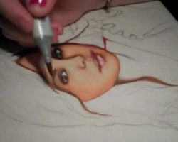
The Traditional Way. Take a sheet of paper, grab a pencil, and go to town! If you don’t have a graphics tablet, this is probably the way you want to go – nothing invites a headache like trying to draw with a mouse. Things you’ll need: paper, pencil, eraser, pen, ruler, compass, possibly markers, a scanner, and basic photo editing software. Draw your page, scan it in, make the necessary changes in whatever software you use to resize things, and you’ve got your page all set to go.

The Digital Way. If you’ve got a tablet or are just that good with a mouse, you can make the whole process digital. It can really take some of the blood, sweat and tears out of webcomicking. Use whichever graphics program you’re comfortable with, whether that’s Adobe Photoshop, Corel Painter, Manga Studio, SAI, or just good old MS Paint.

Half-and-Half. This may be the most common way. Draw your line art by hand, scan it in, then add your tones or color digitally with your graphics program.

Creating quality webcomics mean finding what works best for you and still works within your budget. If the only scanner you have access to is Aunt Selma’s ancient museum piece from the mid-nineties, you might want to consider going all-digital. Likewise, if you’ve got a fantastic scanner, but your only graphics program is MS Paint, you might want to stick to doing it by hand.

Manga Studio

Software to Help You Out
If you’re looking for the best software out there dedicated to comic creation, it’s Manga Studio EX. Plan, sketch, ink, and tone your work, all in one place. You can work on individual page files, or group them together in stories (an option I use to keep my chapters of Strawberry Syrup together). With a variety of pens and a whole library of screen tones, you’ll definitely find what you need to make your comic look professional here.

Artists familiar with Photoshop shouldn’t have any problem navigating Manga Studio or its layer system, but if you’re new to it all, playing around for an hour or so will get you familiar with it pretty quick (of course, you could also read the manual). You also need to figure out what page size works best for you and play around with the guidelines. Manga Studio is set up for creating comics for print, but if you don’t want to deal with safe zones and bleeds and all that technical stuff that doesn’t really apply to webcomics, you can just turn the guide layer off.

I love Manga Studio’s pencil tool. It really simulates a physical pencil for me, and makes sketching easy and smooth. The pen tool provides a nice, smooth, solid black line. The tones take some getting used to, but they do make your comic look professional. Manga Studio also makes it easy to add text and word bubble to your comic.

If you’re looking for a program to color with, I would not suggest Manga Studio, but for digital sketching and inking, I don’t think you can beat it. I use it to organize, sketch, and ink all my comic pages, then export them into Photoshop to shade and resize them. I’ve also taken to sketching many of my stand-alone drawings in Manga Studio before transferring them over to Photoshop for coloring. Working together, they’re ideal for me.

If you’re looking for the single best program for doing a black and white comic, then definitely check out Manga Studio EX. Or, try Manga Studio Debut for a cheaper option. Fewer features, but you can always upgrade later.

Tools of the Trade

What You’ll Need To Make Your Webcomic
Whether you’re a traditional pen and paper, scan-it-in webcomicker or a member of the digital art world, there are a few things you’ll need.

Helpful Stuff from the Web

Here’s some sites offering either advice or products that will help you on your way.

Blambot Comic Fonts
The home of great fonts on the web. So long as you aren’t planning on pitching your comic to TokyoPop or another big publisher, you can download and use most of these fonts for free.

The Psychedelic Tree House
This place has a lot of links to blogs full of helpful information to help you with your webcomic. Plus, the largest collection of webcomic logos that I’ve ever seen!

Statcounter
The free way to track traffic to your webcomic.

Prep Work: How Much Should You Do?

Before you launch your comic…
A Little Planning Now, Far Fewer Headaches Later!It’s a common question: before you launch your new comic, how much work should you do?

Answer: If you want a good, high-quality comic that updates regularly, a lot. However, some types of webcomics involve more forethought and prep work than others.

If you’re planning on a non-sequential strip, where each strip can stand alone and still be enjoyed, you’ll have a lot less work to do. Typically, this form takes less planning than others. If your strip has recurring characters, spend some time designing them and refining their look before your first strip goes up. Also keep track of strip ideas, either in a Word doc or notebook. That way, you’ll never have to struggle for what to draw when the inevitable brain block kicks in.

But what if you’re doing something with story arcs, where the tale unfolds page by page, week after week? If that’s the case, there’s a few things you should do before your comic ever sees the light of the internet:

Outline your story. Write out all your major plot points. You don’t need to hit every single twist and turn – some will likely surprise you – but work out the general idea of where you want to go and Big Twists or Events that need to happen.

Think of it as mapping out a road trip. You know where you want to end up each night, but you may make unexpected detours and run into great surprises (or a few hang-ups) along the way.

Flesh out your world. For fantasy stories, that means world maps and a lot of set work. Figure out what the main places look like. Does your story take place in a mystic forest, a quaint village, an epic city, or all three? Draw those places and work out the gist of how they should look. Is your setting based on an ancient culture? Medieval Europe? Asia? Victorian England? Is it a magical world? Steampunk? Pull out the research books, determine your technology level or your magic systems, and define your world’s cultures in – at the very least – some broad strokes.

The more time your characters are going to spend in an area, the more time you need to spend developing it. It will add a feeling of depth and dimension to your webcomic.

Develop your main characters. Your characters are your connection to the readers. Readers will forgive a lot in terms of webcomics, but if you don’t have characters they can get invested in, they’ll stop reading.

So, don’t just refine their visual design or say, “Okay, he’s a mage. He uses magic. Ta-da!” Give him a backstory. Figure out where he’s from, who his family is, his likes and dislikes, and so on. How did he learn magic? A royal academy? The village shaman? Self-taught? How does his family feel about his magic? Do they support him? Did they disown him? How does HE feel about his magic? Blessing? Curse? Maybe he always wanted to be a florist instead.

Thinking about these things will help you create fresh, original characters that won’t feel like cookie-cutter products to your readers and will help you tell a better overall story.

Thumbnail. Thumbnails range from small, quick doodles to detailed drawings, but they all do they same thing: they help you visualize how each page should look and work out any layout kinks before you draw the actual page.

If you have the attention span, you could thumbnail your entire comic before ever starting the first page, but I suggest at least doing your first chapter or two, and try to keep at least a chapter ahead of where you are in the comic. Doing so will help you spot any immediate kinks in your plot and let you work out plot holes before you trap yourself in a corner.

Modern world storytellers, don’t think you get our of all the work! All of these steps apply to you, too. Draw out the main locations you’ll be using in your comic: their school, their houses, their workplace, their favorite hang-out. You also need to put just as much thought into your characters and do your plotting and thumbnailing, too.

A little forethought and planning goes a long way towards giving your comic a high-quality feel and insuring your readers are enjoying the best possible story you can give them… not to mention, saves you on plot-based headaches later!

Keep a Sketchbook

And Keep It Handy!
One of the best things you can do as an aspiring webcomicker is to get yourself a good sketchbook. While there’s nothing wrong with digital sketch files, there’s something to be said for putting pencil to paper and letting your creativity run wild – and it’s definitely a plus when you’re brainstorming and working out story details! Plus, it’s a lot harder to just delete a sketchbook page, and you never want to do that – an idea that doesn’t work out now may come in handy later or spur on a new, completely awesome idea when you least expect it.

A few things to look for in a good sketchbook:

Binding. How is it bound? Spiral-bound books lay flat, but it’s a lot easier to tear pages out – whether you wanted to or not. Stitch-bound books don’t always lay flat and take up more room, but they tend to be more durable. I’ve used both kinds, and about all I can say is that it really depends on which one suits you better, personally.

Size. Sketchbooks come in all sorts of sizes, from ones that can easily fit in a back pocket or purse to ones larger than you typical printer paper. The pocket-sized ones are great if you tend to get a lot of ideas on the go, but for most of my brainstorming, I prefer the medium-to-standard-sized ones. They give you enough room to really explore ideas and draw everything from characters to cityscapes, plus all the notes you’ll want to jot down. Plus, if you’ve got a scanner, you’ll want a page size that will actually scan in one pass.

Paper. Do you like working in pencil? Pen? Marker? Watercolors? If it’s one of the latter, you’ll want to make sure the paper is thick enough to handle your medium of choice without bleeding through to other pages. Make sure the paper is acid-free; that means it’s meant to last and preserve your work without turning yellow or crumbling after a few years. Other than that, you’ll want paper of the right texture and thickness that best suits you. Most good sketchbooks have the paper weight marked on them. I personally prefer a paper weight of around 70 lbs., with a little bit of texture. Not so much that your average micron pen can’t draw a straight line, but still some texture. Other people prefer the extremely smooth feel of Moleskine sketchbooks.

Finding the best fit for you may take a little trial and error, but once you get used to working out your ideas visually, you’ll be glad you found one that works for you. To get you started, here are a few suggestions.

mportant!

Have a Buffer!

That means finishing pages before the first one ever goes up. I suggest having either your first chapter or at least 20 pages (or strips) done before launching your comic.

Why Do You Need a Buffer?

Build Your BufferI know, I know – you’re eager to introduce your webcomic to the world as soon as the first page is done, but trust me on this one. Sometimes, real life will just whack you upside the head. Family emergencies, technical failure, or author burnout may demand you take some time off. By having a buffer, you’ll be able to take the time to deal with life as it comes up and still not miss an update.

Readers are, as a whole, fairly forgiving with webcomic artists. That said, if you keep missing your updates, you’re going to lose readers. With a buffer, you can go weeks without drawing a page and still keep updating.

If you do need to miss an update or two, be honest and upfront with your readers. If you’re sick, tell them. If it’s a family emergency or technical issues, let them know that, too. You don’t have to go into detail, but your readers are invested in your comic – and they’re invested in you. If you disappear for a few weeks without a word, they start to worry about you.

Be nice to your readers. You don’t have to share every detail of your life with them (because, hello, creepy +TMI is not a good combination), but keep them in the loop.

Should you have to go on hiatus (an extended period without updates), here are a few tips on how to handle it in our All About Hiatuses post.

Other Helpful Guides

Never Hurts to Have a Sign Post…
The best way to get the hang of doing webcomics is to read a lot of webcomics and regular comics or manga… and to draw a lot. But it never hurts to have a reference, and that’s what these books are – great references. Check them out and see if they’re something that might help you!

Note: Most of these are in manga-style – mainly because that’s the style I use and the style I like. But there are many different styles of manga, and the basics are still the same for crafting a great comic, no matter what kind of comic you’re doing.

Where to Host Your Webcomic

Finding Your Home Online
Alright, so you’ve done your prep work. You’ve practiced drawing your characters til your fingers went numb, filled an entire sketchbook with settings sketches and ideas and plot twists, and you’ve built up a nice buffer of fully finished pages, ready to share with the public. Now, it’s time to take the plunge and put your comic online.

This is the part that makes turns your comic into a webcomic, but this could be the most perplexing part: where, exactly, do you host your webcomic?

You’re in luck! These are great times to be a webcomicker, and you’ve got plenty of options. Here are a few of them.

Build your own website. Have you got some programming skills and some extra cash? Then creating your own website might be the path for you. This is the only way to have complete control over every aspect of your comic. You choose the layout, add special sections like Character Bios and World Information, put up your commission prices (if you’re offering them), integrate a blog or a forum – your imagination’s the limit! Well, that, and your budget.
Pros: Complete control, your own domain name, and the ability to craft an entire website devoted to your masterpiece.
Cons: You’re completely in charge, which means you have to wear a lot of hats – programmer, graphic designer, marketing exec, publicist… You’ll have to decide if you’re going to have ads, where to put them, and how to manage them, along with keeping all the content up to date and figuring out how to build your fanbase. It’s the most work-intensive of the options.

Use a webcomic publishing site. There are several sites out there devoted entirely to building communities of webcomics. You might not be able to customize the total look the way you could if you had your own website, but you also don’t have to worry about doing everything. Some even have ways for you to make money off your comic.
Pros: No programming experience needed! You also get to be part of an established community, which helps guide new readers to your work. Each site/community has their own personality, so check them out to see which one fits you best. Another pro is that many of them are free (although some have special features for “premium” users).
Cons: Less control over the total package, and you have to play nice with the rest of the community. Be sure to read all terms and conditions before signing in. Pay especially close attention to restrictions and make sure you retain all rights to your work.

Use deviantArt. It’s not a comic-specific site, but it is an art community site and there are plenty of people who use it to host their comics.
Pros: deviantArt has a large community already built in. With their gallery system, you can separate your comics and extra are into different folders. There isn’t direct advertising (and please, don’t be a spammer), but when someone favorites your work, other people can find it through those people’s favorites. And, as a recent addition, deviantArt has added the ability to sell premium content.
Cons: It’s not a webcomic community, and it is massive, meaning it could be hard to find your work. Also, some features are only available on Premium accounts, and while there are ways to customize your front page, you can only do so much.

Those are a few of the options available for hosting your webcomic. If you haven’t found a good fit for you, be creative! If a blogging platform suits your needs, use a blog. It all depends on how much work you want to put in, the benefits offered, and which site you like best. Just be sure to read all the terms and conditions first.

Webcomic Hosts

There are several sites out there devoted to hosting webcomics. These sites have built in communities with readers eager for new, quality webcomics. Here are a few of the ones I check out when I’m looking for new comics to read.

MangaMagazine.net
A free site that works on a tier system. Be sure to read their terms, as they require certain tiers to post on their site before any others (If, ya know, you’re going post your comic in a few different places).

Tapastic
Another free site, this one with a pretty cool format for webcomics. It lends itself well to both traditional and more experimental “visual stories.” You’ll have to check it out to see what I mean.

Smack Jeeves Webcomic Hosting
One of the longest-running webcomic hosts out there, this old standby has stayed current and competitve with their features. The basic level is free, while there is also a premium version with special features – for a fee, of course.

On the Topic of Partners…

A Little Advice for Those Not Going It Alone

Awhile ago, one of my readers asked me how the whole comic thing works with a partner, as she was thinking about starting a webcomic with a partner. Well, the short answer is: it depends on the partners.

Hear me out before you dub that the cop-out answer. There are numerous ways for people to work on webcomics together. For example, a group might decide to do things the Western way, with one person writing, one penciling, one doing flats, and one doing the coloring. Teams of two might have one writer and one artist – if you go to OnlineComics.net, you’ll see a lot of postings looking for either a writer or an artist in the forums. It’s a great way for writers who have a great idea for a comic but perhaps not the most talent in the art department or an artist really wants to do a webcomic but can’t write. Other teams may have less defined roles.

When it comes to Koni and myself, Koni’s role is that of “creative collaborator.” Essentially, she’s my muse. When I need a sounding board, get stuck on something, or need to work out the story lines, I turn to Koni. Waaaaay back in 2006, Strawberry Syrup got its start when Koni and I were watching a vampire anime and wondered why all the half-vampires always side with the humans. From there, one thing led to another, and next thing we know, we were in the nexus of creative fusion. We tossed out a lot of story ideas back then, ones I still have to get to. My role is to then take those ideas, flesh them out into chapters with dialogue and plots, and then do all the art.

Some things to consider when you take on a partner or partners for a webcomic:

Make sure everyone understands and is comfortable with their role.

Make sure this is someone you can work with for the long haul if you plan to do a long-run webcomic. Consider doing a trial run – a short one-shot story of 10-20 pages to make sure the two of you can work together. It’s also a good idea with groups, to make sure everyone’s happy with their roles.

Make sure everyone understands and is capable of meeting the deadlines. Your writer has to have the final draft of each page to the artist in enough time for the artist to finish the page in time for that week’s post. Having a sizable buffer will help here.

Be flexible and open to change. If your partner has some ideas regarding your area, at least listen. It could make your webcomic all the better.

Consider a legal agreement defining who owns what and how any profits will be split. This is especially important when you don’t know your partner, only have a professional relationship with them, or have plans to get your comic published. The last thing you want is for legal squabbling to get in the way of things.

Those are just a few of the things to keep in mind when starting a webcomic with partners. And remember, webcomics are supposed to be fun! Whenever more than one person is involved in a creative project, chances are there will be conflicts. Just try not to let them get too blown out of proportion, and you’ll be fine.

Places to Promote Your Webcomic

Or Check Out Your Competition!
Once you have your webcomic up and running, you’ll need to get some readers… and the best way of getting readers is webcomic communities and lists! Here are a few of the ones you’ll want to be on.

OnlineComics.net
This site gives you your own forum, advertising possibilities, and the ability to see how many fans you have and what they like to read. You’ll need at least 10 pages done before you’ll be listed here.

buzzComix
This site lists comics by popularity through voting. You can even offer incentives to get people to vote, like extra art or even pages. You’ll need a banner to join this site.

Top Web Comics
Pretty much the exact same thing as buzzComix, but hey, the more exposure, the better!

The Belfry Webcomics Index
Another list of webcomics. It’s geared towards furry comics, but it allows other kinds to join, too.

Comixpedia
The Wikipedia for Webcomics. List your comic here and make yourself a nice page – you might snag some new readers!

The Webcomic List
Yet another webcomic listing. If you don’t add yourself, one of your readers just might!

Start Your Own Squidoo Lens!
That’s right, Squidoo’s a great place to promote your webcomic, too! Build a lens dedicated to your characters, give readers an introduction to your story, put up polls, and don’t forget to add a guest book, all for free!

Kit’s Favorite Webcomics

The Ones I Love To Read
If you want to make your own webcomic, you probably have a list of ones you love. I know I do, and these are some of my favorites.

Strawberry Syrup
Shameless plug time! Yep, this is my own webcomic. Strawberry Syrup is the story of Sammy, a half-vampire severely lacking in the traditional angst catagory, and Hunter, his own personal (and kind of inept) Van Helsing. If you’re looking for a deep, dark, serious story questioning the meaning of existence… you might want to look elsewhere. XD

No Rest for the Wicked
Follow an insomniac princess, Little Red Riding Hood, and Puss in Boots on a quest through a land of fairy tales more like the original Brothers Grimm than anything you’d ever find in a Disney movie. Delightfully dark with a sense of humor, this well-written and stylishly drawn comic will pull you from page to page and leave you wanting more.

Looking For Group
Are you a fan of MMPORPGS? Love poking fun at them and time-treasured fantasy tropes? Then you’ll love this comic. It will have you laughing out loud.

Lackadaisy
Fantastically drawn fuzzy comic from the gangster era. The art will leave your jaw on the floor… and the characters are great, too.

Inverloch
One of those webcomics to make it onto the shelves of your local bookstore. Beautiful artwork, compelling characters and storyline, and better yet, it’s complete – no waiting for more pages or worrying about the author going on hiatus! Be sure to check out her other comic, The Phoenix Requiem, too!

ps238
In a world populated with superheroes, there is the inevitable issue of… what to do with all the little superkids. Aaron Williams answers this question with ps238, a secret public school geared towards educating the next generation of superheroes. But what happens when the son of the two most powerful superheroes in the universe HAS no powers? While it starts off a little slow, this comic’s got humor, time-travel, super-powered hijinks, and some honestly touching moments.

Runewriters
Another high fantasy one, featuring demonic aberrations, a possibly corrupt holy order, and a shapeshifting runewriter who screwed up a spell and is now trying to fix that with the help of his deaf friend. Great art, great story, and some great humor make this a great read.

Must have resources for the figure drawing artist

Must have resources for the figure drawing artist

The Artwork of Lacy Chenault – from Heart people to Belly Dancers

I Believe I have always been an artist – from a very young age I remember having a huge interest in drawing things – but it’s always been one thing – Women – which started as heart people and evolved to women.

Through High School I got bad grades in everything but art class, even if I skipped a week of school I would always finish my art projects on time, and sometimes do other people’s projects as well. But I feel like my art is at its peak right now – though I secretly hope it isn’t – I would like this to just be the beginning of a mountain rather than it being all downhill from here.

A few years ago – right around the time I moved in with Mark I started to really pick it up again, and since then I have gotten much better. I started my very own website and found the people who really like my art. At least I think they do?

I think the biggest thing for me is when I just recently signed a contract – I will be receiving 12% royalties from a company selling my artwork on cross-stitch patterns, and sales at my cafepress shop seem to have taken off. I am not one to usually have an ego about things, but at the very least at this point I can say I am proud of myself.

I can look at my art now and really see that I have gotten better – sure it has taken years and many drawings have been thrown in the trash, but after all that it has actually gotten better…wow.

Earlier this year I had my first “Art Show” at a local coffee house – my art was up for one entire month. MY ART was the sole décor for this coffee house for all of the month of February – sure when it happened, I didn’t think I deserved it, but looking back – I did. I loved that people could see my art up close and personal – not only on the web – my scanner never does them justice anyway. It was really nice to see that people really did like my art – lets be truthful here – a lot of people lie on the internet, I can’t read their expressions when seeing my art, so I never really know what they think of it – that is of course, unless they buy it.

It started as just Fairies here and there, some Goddesses – then it grew to include the Zodiac collection, and just recently I started Drawing Belly Dancers, as I myself am now one – it has inspired me in so many ways with my art.

I draw dancers from my class whether they know it is them or now – they are at the very least my inspiration – I have drawn my teacher twice and I think she likes them. I take tons of pictures at every show – just to take them home at get ideas for my next drawing.

It is really ever evolving – you put the effort it and you will see results – it may take years – but it is always about patients – with anything you want to get good at.

Giovanni Civardi – Drawing the Female Nude

Lots of different poses, real looking women
For many years I have been drawing women, and only women. The female figure I think is just nicer to look at.

The problem I would always run into when starting a drawing is thinking of a pose, and actually pulling it off. That is why I purchased “Drawing the Female Nude” at my local Barnes and Noble. The only other option I could think of was to hire an actual model, and that’s just too expensive and awkward.

Drawing the Female Nude is written (and illustrated) by Giovanni Civardi, an Italian artist and instructor who also wrote and illustrated “Drawing Human Anatomy” and “Drawing the Male Nude”. His drawings are as realistic as they come, which is how I like it.

In this book he uses two models, one that is tall and has more boyish figure and one who is a bit womanlier in the hips and butt. Both of them are definitely European, you can tell by the furry armpits, which you can “edit out” in your own drawings easily, but it really doesn’t detract from the book at all unless you are tremendously shallow. That is also part of the reason I really like this book.

The women in this book look like real women. Their breasts are not super-round and perfect, their brows are not perfectly plucked, and they do not have washboard abs. I am not saying they are fat (I am probably bigger than them), they are real.

These two women are drawn in many different poses including standing, sitting, stretching, twisting, turning, lying, and even some yoga positions from just about every different angle. Each pose includes his own tips on pulling it off, and information on different techniques and materials. He uses charcoal and pencil to sketch out the women. There are also a few actual photographs of the models in this book.

I really like his tips on shading and shaping the muscles. He really teaches you a lot about the female muscular structure in this book too, which is something every artist should study a bit about to reach his or her full potential. He encourages every artist to find his or her own unique style, not just to copy.

This book was definitely worth the $14.95 I paid over three years ago. I still use this book as a reference, and I do feel that it has made me an improved artist. This book I think would be an excellent gift for all artists who like to draw real looking women, whether amature or professional

The Nude Figure – a visual reference for the artist

I know you will find what you want in this book. It is full of good poses, which are lit very well.
I browsed through this book at a Barnes & Nobles a few weeks ago, and almost immediately fell in love with it. But I did have to wait to go online as it was nearly 30.00 at B&N and I knew I could get it cheaper at amazon.com, which I did for a mere 22.00 with shipping.

Before “The Nude Figure” my best reference book was “Drawing the Female Nude” by Giovanni Civardi, which featured his drawings of two models in various poses. It is a great book for the beginner, but after five years of using it I needed something new – and Playboy just wasn’t working.

The Nude Figure by Mark Smith featured only photographs of various models and all kinds of different poses. All of the photographs are in black and white which is a definite plus in my mind, helping you to see the defining lines and edges. The poses are divided into chapters as follows:

Standing Poses – This chapter is full of your basic standing poses. Arms up, arms down, from the side, from the back.

Reclining Poses – All kinds of laying down positions, all from different perspectives. Some look quite easy to draw and others are quite hard.
The Figure on a stool – These I find quite difficult simply because of the stools – I am not good at any kind of still life, even if it has a woman sitting on it.

Bending Poses – Most of these look like stretching before a workout poses. I don’t se how they could be useful in a work, but for practice everything is good.

The Figure in motion – I am very happy with this section as I do a lot of fairies and it is full of people jumping up in the air – something you could never get a live model to hold.
The Pregnant Figure – There are only a few pages of this, and I’m glad they put in here. It’s not too often that you get to see a nude pregnant woman to draw from. I think this will come in handy someday.
Unusual Poses – Just like it sounds, many of these aren’t very practical, but very useful in learning how different muscles shift in different positions.

The bulk of the photo’s are in Standing, Seated, and reclining poses. Those fill up most of this book.

Also the people in this book are all pretty fit. There aren’t any fat people in here, not a big scope of different shapes. Again, I am happy with this as I don’t want to draw fat people, but other artist might be disappointed by this lack of diversity. Some of the women have hairy armpits though, and some don’t – that’s diverse enough for me.

Take More Risks – Dynamic Figure Drawing

I highly recommend this book for any artist who just wants to tweak what they already know.
The moment I browsed through this book I knew it could help me tremendously. Dynamic Figure Drawing is a book for the already knowledgeable artist, wanting to better understand the human anatomy – something very important in drawing the figure.

I would start out with a book such as “Drawing the Female (or male) nude” by Giovanni Civardi, which only has poses of women or men, and Giovanni is much easier to read, easier to understand as a beginner.

What I found most helpful is the artist examples drawings; he shows different ways of looking at the figure to get a good realistic drawing of it. I have found that breaking the body down into simple shapes makes it so much easier to put it all together, adding muscle structures and curves after. He also breaks down the perspective drawings quite nicely,

There aren’t many full poses in this book as he beaks most down to the parts. He has sections on feet, legs, arms, chests, etc. My hands have gotten so much better since practicing them with this book. But I definitely recommend using another book or source for getting you poses, then using this book for the parts you have a hard time with. I recommend “The Figure Nude”, which is full of photographs of both men and women nude in all sorts of poses. If not, a magazine is always a good alternative.

This book is in no way easy reading, in fact it seems like it should be in college art classes all over the place. It is very technical, and I usually have to read over the same section a few times to really get what he is trying to say. So, again, I don’t recommend this book for beginners at all.

For the figure drawing artist who’s been at it for a while, and just has a hard time with certain parts, or has a hard time putting more action into their poses, I can’t say enough good about this book. It has helped me out in so many ways in just the short time I have had it. You can see it in my most recent works (some are featured on my profile) such as Gaia – I would have never tried such a difficult pose before reading this book. I also am not afraid to show hands anymore, because he has made them so much simpler.

I have truly been inspired by this book, since getting it I have been much more creative with my art, and I take more risks. I am very pleased with what this book has done for me.

Jobs in the art field

get serious about your passion

Artist
BSM – Phoenix, AZ
Designer About our company: Our company is one of the leading export companies in China. Our products range from giftware, toys, houseware, hardware, party… …

Graphic Artist
Sodexo – Altamonte Springs, FL
is seeking Graphic Artists for layout, design and… design artwork for proposal and presentation production for new sales and retention. The graphic artist… …

Graphic Artist
L-3 Communications – Atlanta, GA
Graphic Artist – Requisition ID 050503 USA… Solutions – STRATIS The Graphic Artist creates graphic designs, artwork, and documentation layout, for… …

Deals on not so new books
Soometimes it’s a good idea to go the cheap route
I know there are many starving artists out there as well (myself included) but art lesson/reference books aren’t the kind you want to just borrow from the library, it is a good idea to have them in your collection. Sometimes I open up my old books I haven’t looked at in years and it’s like I’ve never looked through them before – turn old inspiration into new – eBay is a good place to get good – and cheap art reference books.

Markers And Sketch Pads For Teens

Markers And Sketch Pads For Teens

Choosing the Right Markers and Sketch Pads for Teenagers

These Markers And Sketch Pads For Teens have been handpicked to include the best quality, most popular, top rated and best selling styles for you to choose from.

The basics will get you started in drawing with markers (copic, permanent, anime, manga, and more). Watch the drawing lessons and videos showing step by step drawing instruction and techniques. Discover the best selection of markers and sketch pads (sketch books) that your teen artist will love.

Featured: Bee Paper Bleedproof Marker Pad, 8-1/2-Inch by 11-Inch

COPIC Manga Wallet Set B- 24 Sketch Markers in a Travel Wallet

Good for teens to carry with them in a backpack or purse
This is a great little wallet that teens will love – there is a wide range of colors, 24 in total, that are a great start for young artists. The handy wallet means they are easy to carry. These markers are alcohol based, acid free markers that are non toxic. They can be used with the Copic air brush for the adventurous. These are best used with Copic marker paper.

Letraset Pro Marker Comic Art Set 2, Twin-Tip, 10-Pack

Good for Manga drawing or any animated cartooning
When buying markers in the ‘set series’ look at each set and evaluate how important the items in each set are to the overall project you are working on. In most cases you will find each set has a varied purpose. And, the primary reason each set is sold separately is because they are used more or less often. The rule of thumb then is to buy one of each and then replace each as they run low.

More Magic Markers

suggested basic sets
Included in this section are suggested basic sets your teenager will need depending on their art styles and preferences.

For any type of drawing there is a basic requirement for markers or colored pencils for skin tones like the ones here. A blending kit is essential and from there you can add on additional supplies depending on their art work. For example comic artists will prefer vibrant tones like those provided by the Letraset Pro comic markers while manga artists will need the more subtle colors provided by specific manga markers.

Our choices are based on the best value and best quality marker pens that are smudge-resistant when dry, they won’t bleed into other colors but can be blended into tones and shades using duel tips and blending pens.

Of course, using the right type of paper is also essential to great results.

How important is using the right paper for marker art?

won’t any old paper serve???
The simple answer is really really important. If you pick a sketch pad on how cheap it is, you are likely to get light-weight paper that marker ink will saturate to the point colors will bleed into the paper and into other colors. Of course that is the worst case and pretty obvious but with the huge variety of papers available today it can be more than just confusing when you start out. If you consider how expensive it can be if you pick the wrong sketch pad, you’ll see how advisable it is to do a little research beforehand.

Many manufacturers make it easier by specifying on the front cover the type of art work their paper is good for. At the very least you need to target paper that is guaranteed not to bleed colors like this bleed-proof paper available on Amazon.

What to bear in mind when buying sketch pads for marker art

Because markers are alcohol based they will soak ordinary paper and bleed colors together unless the paper has been pre-coated with a solvent to prevent this.
For the same reason, unless you use the proper paper you will find your colored ink from the marker edging outward from the line you intended, the professionals call this feathering.
You want to pick a paper that will allow you to blend colors.
Pick the right paper for the right effect.

Best Bleedproof Paper For Markers

The Top Pick For Markers And Sketch Pads For Teens
If you want to go for the best paper for using with markers, go for the Copic range designed specifically for marker art. This pad holds 50 sheets of thin paper that is completely bleed-proof. This paper is designed to get the best out of alcohol based markers, the smooth surface allows for artistic blending of colors that are ideal for anime, manga and comic art.

Learn how to draw a pine tree

Learn how to draw a pine tree

A drawing of a pine tree – Pinus silvestris

Ten typical features of pine trees are explained and shown in a big size image of a pine tree drawing study. The tutorial explains how to draw the pine from the tree top with needles, the branches to the trunk with different zones of bark. The example drawing has been done in pen on site directly from nature. Learn about drawing a realistic looking pine tree. See more examples, get inspiration for own drawings here.
For those who are looking for a cheap book on drawing trees I can recomend my publication on Blurb “How to draw a tree”
If you were looking for botanical information I can recommend another squidoo lens Scots pine

Image credits: All images on this webpage ,if not otherwise stated, are creations by the author.Images and illustrations of products (in affiliate links) are used according to Squidoo TOS.

An example of a pine tree drawing – 10 typical features explained

Pen line drawing
Below there is a sketchbook study from life in pen, showing a pine tree. If you click on the image a large version accompanied with text will open in a new tab. May be you want to download and print out that file (ca. 2MB) and study it. There are ten numbers with explanations marked in the sketch that point out to some typical features of pine trees. Of course the appearance of pine trees vary between different species,age,environment and conditions for growth,but if you understand and reckognize the important features it will be easy to do your own drawing.

Explanations to a pine tree drawing with detail images

1. I started to draw the pine tree from the top. At first the shape of the tree top was drawn as outline. I looked at the tree, not at my paper and followed the outline I could see against the light sky. That is called blind drawing,if you don´t know about this check the link.


2. Then I tried to identify the pattern,rythm or structure of the pine tree needles and executed these details within the previously drawn outline

3. I noticed 3-4 basic patterns in the needles appearance and made a note of them. You might see things different and may develop your own signs or marks for representation. Perhaps you want to put those on a separate sheet.

4. I recognized that there are thin branches with and without needles at the edges of the bigger clusters. These thin branches look a bit like a spiders web and they contribute to the typical look of a pine tree.

5. Then I continued downwards with the outline of the trunk and added the branches. The branches of pine trees take typical turns, no other trees do it that way. For that reason one can recognize a pine from miles distance.

6. There are also many old,short pieces of branches that make for a tyical appearance too.

7. Bigger branches have clearly visible “shoulders” at the junction with the trunk.

8. A number of branches grows circular around the trunk every year. The yearly growth in height is still visible by the length of the free space between two of those circles,which can be seen by those small dark branch marks in the bark even when the branches are already gone.

The bark of a pine tree changes from top to bottom. in the top area it is bright and sometimes shiny. Then it changes in area of redish surface where the thin soft bark comes of like pieces of old skin.

9. Further down the bark gets darker and rougher with lots of fine lines on the surface.

10. At the bottom the bark is very thick and shows these typical deep cracks and gaps.

11. As comparison I have added a small piece of a spruce tree in the background. By observing and depicting the typical features of a tree it is possible to evoke a realistic impression even if the proportions are not exactly correct.

A pine tree as part of a landscape drawing

This is an India ink drawing which was done on a cold January morning. The young pine tree is an important part of the scenery. It is a different species (Pinus niger) with a more dense tree top. In the detail below one can see how the needle masses were represented by simple strokes in various directions.

How to draw a tree – The book published on BLURB

A field guide to drawing and sketching trees

The little book in format 8X5 is based on the content of this lens. It contains


70 black and white images of pen, ink and charcoal drawings. You will find many of the illustrations on this lens, but others also from related lenses on drawing deciduous and coniferous trees and some extra images too in the book.
The book summarizes my experiences in drawing trees. The majority of drawings are deciduous trees, but there is also an explanations about pine tree drwaing and spruce.

Link to the book How to draw a tree There is a full preview available.

Great examples of pine tree drawings by Artists on FLICKR

The very special tip !!!!!
I am glad that I found these inspiring drawings just by incident. I am glad that meantime the author has added his name. These great drawings are all done by Mike de Weese a professional illustrator..
I write this paragraphs really only to make sure that this link is not overlooked !

Plein air set of ink drawings
This set of Plein air drawings posted by FLICKR user Mike DeWeese contains a series of great drawings, mainly pine trees but also other conifers. The artists has studied all parts of the tree from trunk to tree top, including details and complete forests.
A very inspiring set of work !

How to draw a pine tree – a video instruction

Video for beginners – drawing a pine with ink and brush

Pine – pine tree by yanghaiying

Pine tree drawings online – link list

archive of pine tree drawings

Pine tree – Archives of American Art: Sketchbooks: Curators’ Choice
Worthington Whittredge sketchbook of a trip down the Rhine River 1849 / Worthington Whittredge, artist. Sketchbook : 1 v. : various media ; 15 x 24 cm. Worthington Whittredge papers. Archives of American Art.

Pine Tree Study on Flickr – Photo Sharing!
Nice study by Art*edges on FLICKR
#Loved the wild lines of this pine tree. So full of texture. Watercolors and ink.

Drawing the urban Landscape

Exploring the city with a sketchbook
Between April 2006 and May 2007 I have worked on an exhibition project about the urban landscape of the city of Stuttgart,Germany.
I have selected more than 30 drawings for a book now available online at BLURB.
The first 10 pages show panoramic drawings together with the essay about the urban landscape and the experience of drawing such a complex subject. The following pages show two panoramic drawings per page without text.

More drawing lenses by Edition Handdruck

Landscape drawing – improve your skills efficiently and fast !
8 tips how to improve your landscape drawing skills efficiently and fast.Everybody who can write her/his own name on a piece of paper can achieve a high level of drawing skills. Drawing can be learned much more easy than painting and it gives so much pleasure !Link to some of my sketches and drawing

How to draw a tree
How to draw a tree – Find a collection of tree drawings and explanations how they have been done. Get inspired by famous examples and have a look at online drawing tutorials. Find your own way how to draw a tree.

How to draw deciduous trees
This is an introduction to drawing deciduous trees from life.MPM, Monotype printmaker Martin explains how he draws decidous trees with a pen and with charcoal. There are no rules in drawing,every body can develop a very own way to draw a tree. If your looking for some inspirations or ideas have a loo

Artist sketchbooks – little nothings turn into big somethings
For decades artist sketchbooks have only been noticed by a limited specialist audience which got access to those precious resources mostly only after the death of the creator. Excerpts might have been published in print media, but mostly only at the price of damaging or destroying the sketchbooks.

Sketching gear – what does the beginner need ?
Sketching outdoors is a great activity and a rewarding hobby for everyone. This lens is for those how want to start sketching outdoors in the city or in rural landscape. What sketching gear would you need to have with you ? What kind of gear is suitale and what should the quality be like ?

How to draw water – a drawing tutorial,tipps and tricks

How to draw water – a drawing tutorial,tipps and tricks

Drawing water – tipps and tricks

Water is transparent like glass if it is clear and the surface quiet. The water itself therefore often appears as “not visible”. Natural water in creeks and rivers is mostly not 100% transparent. Anyhow drawing water can be a challenge no matter whether it is without color or not and moving or not.

What is visible when we look at water are the reflections on the water surface and those things that one can see under the water surface. Big masses of water like the sea appear in opaque colours, often it is the reflected color of the sky or a muted variation of the sky color mixed with the color of th water. Also the waters of a big river can look opaque. Depending on the situation there are different strategies to depict water in a drawing. Unfortunately in the most cases the water you want to draw appears in a very complex and always changing mix of reflections and transparencies. On this website you will find tips and tricks how to depict water in a convincing way.

What you see when you look at water an analysis before drawing

What you see when you look at water an analysis before drawing
The appearance of water, especially of moving water, can be very confusing. I commend to sit down and watch the water flow and to make notes of what you see:

1. Reflections of the surrounding landscape and sky

At Harmony lake you see the typical mirror effect of a flat water surface. Clouds and trees are reflected on the water. The reflections of vertical elements converge towards to the viewer, as the trees are in far distance that effect is not visible that much.

The mirror effect can be perfect on a totally quiet water surface. If there are ripples the reflected forms are interrupted in a certain typical pattern. Tree trunks are deformed to wavy lines or even interrupted by bright reflections of the sky colour on the ripples. The contours get blurred or frayed as you can see in the black and white image of tree reflections.

2. Stones, sand and other things at the bottom of the water, changed in color by the turbidity and light

The beautiful view of the chalet at a lake is a very difficult subject as the water is very clear and reflections of the landscape above water level and the lake bottom are visible and overlap in an intriguing mix.

Almost any water surface, be it a river or a lake, shows a dark line directly at the bank. In the image of a quiet lake you can see that thin dark line, a shadow of the bank. When you look at the water surface yiou will notice that the closer you get to the bank the more the muddy colour of the water gets mixed intot the reflected color of the sky.

Water pen sketch

In this sketch I tried to depict a water surface with the reflections of a post. From left to right there are more and more ripples. The more the water moves the more difficult it gets to draw water. Appart from horizontal lines or short strokes flat elliptic lines can evoke the impression on water.
The reflection of the post gets more and more blurred or distorted the more the water moves and the bigger the ripples are.

If you experiment with horizontal and elliptic lines to represent ripples on the water you will get a feel what works and what not.

Helpful books on drawing water, river and seascapes

Amazon offers several books that deal with drawing and painting of seascapes and rivers and ponds as frequent and interesting elements of landscape drawing.
“Down by the sea” got excellent reviews and so does “drawing sceneries” more a compendiium of various landscape types.

Online Tutorials on how to draw water

Diane Wright is an experienced artist. She has written a number of great tutorials on landscape drawing. Her tutorial on drawing water is comprehensive and covers the subject very well.

DRAWING WATER – tutorial by Diane Wright
DRAWING WATER tutorial by Diane Wright. Artist Diane wright has written a great comprehensive tutorial on drawing water that covers all aspects very well.

Observations on moving water – analysis before drawing

Moving water is more difficult to draw as the ripples or waves will not mirror the surroundings as quiet and complete as a flat lake for example does.

One can see different patterns of ripples, depending on the water follow. However once the appearance of a ripple is understood and seen correctly drawing moving water becomes easier as all ripples show the same characteristics.

Simply spoken ripples always have a bright top and a darker flank. Ripples vary in direction, curvature and width. In the darker flanks the surrounding landscape is mirrored as more or less thin colour bands, whereas the bright tops reflect the sky and /or might be white because of foam.

Reflections on a pond in the woods

Gouache sketch in the forest diary
In June 2011 Im sketched a pond in the woods. When looking at a water surface from a low view point there is almost no transparencies to see, one can concentrate on the pattern of reflected colours and froms on the surface.

Pastel sketch drawing of moving water

This is one of my early humble attempts to sketch water. I have a vivid memory of thoset 30 minutes I stared into the water, concentrated and tried to draw what I saw. Suddenly I understood the Hermann Hesse novel Siddartha much better, contemplating on a river or stream changes your mind and way of thinking. It was a happy afternoon and for that reason I kept this humble sketch as a souvenir. The water was flowing quickly between those big stones near the river bank creating a confusing pattern that changed and re-shaped again and again…

Stunning realistic drawings of water

Emma Stibbons creates amazing works in charcoal. Her Upstairs gallery portfolio contains impressive seascape drawings in big size.

How to draw deciduous trees

How to draw deciduous trees

Tips on how to draw deciduous trees

This is an introduction to drawing deciduous trees in a realistic way from life. This site explains how to draw deciduous trees with a pen and with charcoal. If your looking for some inspirations or ideas for tree drawing have a look here.

The website discusses the main features of deciduous trees and how to draw them. First simple drawings point out to the basic proportions and parts of a tree. Then tree trunk, branches and tree tops are explained further. Examples and methods how to represent bark and foliage of trees in drawings are given. Finally the making of a very detailed ink drawing of an apple tree orchard is demonstrated in a sequence of intermediate states. Herre you can see the process of drawing step by step.

Let´s try to draw some simple apple trees !

A tutorial for beginners
In the beginning a simple four step approach to drawing trees with pen or ink might help.

In order not to get overwhelmed by the many details of a tree I commend to begin with studies from a distance.
First try to depict the shape or outline of trunk and tree top.

In a second step larger internal forms in the tree top are mapped. The confusing pattern of leaves in fact follows a certain order and on observation one can see that the leaves are organised in typical “groups” following the branch and twig structure of the specific tree species.

In a third step the larger forms can be described further by filling them with a typical smallpattern that the leaves are forming.
I a final fourth step one might add hatches to add shadows, thus the drawing gains more three dimensional look.

No.1 : Starting with the trunk

After the outer form was established I continued with drawing the trunk and then continued to represent the foliage in shade on the right side of the trunk in small circular movements with the pen.
Later the hatching was added for the shadows on the trunk and for the darker tonality in the shadowed area.

The trunk of a tree is a very interesting subject for further exploration. The ink drawing below shows the stem of an old apple tree.

No.2 Mapping the tree tops

detailed view of line pattern
The foliage of trees shows, depending on light, lots of different shades or tonalities. By squinting I identified darker and light areas or clusters of twigs with foliage that have different tonality. Then I try to map the borderlines between darker and the lighter areas by blind drawing.. With some experience you will notice that eqach tree species has a specific “organisation” of branches and twigs and therefore shows a typical pattern of leaves which are grouped by the twigs and branches. So the method here is to establish the bigger forms first and then proceed to the next lower level in the hierarchy.

No.3 Patterns of leaves and foliage

round or jagged outlines?
Each tree species has it´s own pattern or rythm of leaves. I tried to imitate the rythm I saw with my pen movements. The leaves seemed to be arranged a bit like little roof tiles. Also it makes a big difference whether the leaves have rounded edges like on fruit trees or more sharp distinct edges like a red oak or a maple tree. Jagged leaf outlines should be represented by a pattern of jagged lines if the natural character of the tree shall be displayed in the drawing.
With light or heavier pressure on the pen I tried to create thinner/lighter or thicker darker foliage.

How to draw foliage in tree tops

This sketchbook drawing shows a group of apple trees. In the detail below it can be seen how I tried to represent the variations tonalities in the foliage. A realistic impression can be achieved by putting emphasize on the outer branches and leaves of the tree tops and drawing them in very dark tonality. Leaves and twigs at the very tree top often seem to look very dark or almost black in contrast the bright sky. As soon as you move your eyes downwards from the very tree top the foliage seems to get lighter and colors become more visible, because the bright sky does not dazzle the eyes so much.

Apple tree orchard – tree drawing in ink

Development of a landscape drawing with trees
apple trees with ink drawing on site, plein air With more experience the draughtsman develops a strong feel for proportions and an excellent eye to hand co-ordination. The masters seem to know already how the finsished drawing will look on paper and all they need to do is to put it down with their drawing tool. I have not come that far yet, but meantime I can estimate proportions fairly well and I find myself starting a drawing without establishing the outlines visibly on paper first.

See here an example of a detailed landscape study, an apple tree orchard. I have documented the progress of the drawing on several subsequent days. I avoided cross hatching with purpose in this drawing as cross hatchings tend to obscure details and thus reduce the clarity of a drawing. Of course sometimes that can be a wanted effect too.

ink drawing apple tree orchard

I started the drawing with the base of the important tree trunk on the left and then proceeded further to the other more distant trunks and finally into the branches and tree tops. The tree trunks functioned as basic grid and reference for proportions and spatial order. Working all over the page helps to keep the drawing coherent and to make the right decisions about gradadtions of tonalities too. The best is to know from the very start which parts of the drawing shall be the lightest ones and which ones should be the darkest.

In the decidous forest – a charcoal drawing

Oak and beech forest in spring,strategies to deal with an abundance of detail.
The drawing on the right was done on site very near to my home. It shows a beech and oak forest in late spring. I remember those big leaves of Coltsfoots that bloom early along those machine path prepared for logging of timber. You can see those leaves in the foreground on the left.

I found the best way to adopt to the overwhelming amount of details in a forest scenery is to examine the subject before starting with the drawing. I decided to built the picture around the bright spot where the sun hits the grass. It was that light that attracted me to choose that subject.
The big trunks and some smaller ones established the composition grid in this drawing. I start with light marks and lines because mistakes can be wiped out with a cloth easily and the darkest darks should be placed at the end with consideration. The darkest and the lightest spots in a drawing attract the viewer eyes like strong magnets. Wrong placement, wrong form of those “highlights” can spoil the most beautiful drawing. In order to pull the viewer into the picture I placed the sunlit spot of grass at the end of the over grown path in the very center of the paper. To enhance the brightness I placed the darkest darks around the bright spot, which seems brighter than the blank paper in the sky or the foreground.

After the vertical grid was established I concentrated on typical structures of foliage and shrubs and added the background, which filled the spaces between tree trunks. I used a soft eraser to recover some lights in the background to imitate the impresionj that the pattern of light spots on the leaves evoke. To improve that illusion I added dark small marks that resemble the form of leaves.

Finally the foreground was put in. Instead of trying the impossible, to copy each and every grass or leave, I concentrated to represent samples of some of the typical forms and structures I saw. After all the drawing is a simplification of the real scenery, that is just detailed enough to keep up the illusion.

How to draw a tree – The book published on BLURB

A field guide to sketching and drawing trees

70 black and white images of pen, ink and charcoal drawings. You will find many of the illustrations on this lens, but others also from related lenses on drawing deciduous and coniferous trees and some extra images too in the book.
The book summarizes my experiences in drawing trees. The majority of drawings are deciduous trees, but there is also an explanations about pine tree drwaing and spruce.

Link to the book How to draw a tree There is a full preview available.

Quick tree sketch with charcoal

One day a thunderstorm surprised me when drawing. Quickly I seeked cover under a bridge and made a quick drawing of young trees in a rain shower

A look to the edge of a forest

Drawing a forest with pen
This sketchbook drawing was part of an exhibiton project “A year in the vine yard”.
The full sketchbook can be seen here “A year in the vine yard”
Study of a willow tree
Ink drawing in four stages
drawing of a willow tree in four stages

This ink drawing was done in several short session of 20-30 minutes due to cold winter temperatures. The depiction of the many think twiges at the top of the willow tree was a challenge. Not all of those visible in reality found their way into the drawing. More than ofteb less is more in drawing.

Drawing the urban landscape – publication on Blurb

Exploring the city with pen and sketchbook

Between April 2006 and May 2007 I have

worked on an exhibition project about the urban landscape of the city of Stuttgart,Germany.
I have selected more than 30 drawings for a book now available online at BLURB.
The first 10 pages show panoramic drawings together with the essay about the urban landscape and the experience of drawing such a complex subject. The following pages show two panoramic drawings per page without text.

How to Draw by Joy: Baby’s Portrait

How to Draw by Joy: Baby’s Portrait

Step by step baby portrait pencil drawing

I am presently working on drawing this little one at two years old in a illustrations for a children’s book I am creating. Two of the illustrations are included on this drawing tutorial below.

This is a free drawing tutorial by Joy. Pencil drawing is a skill, that to a degree, can be learned. Of course it helps if you have an eye for it, and a creative streak within you. However, the skill of drawing can be learned by anyone with the determination and discipline to practice.

Through drawing, I have improved my photography by learning to see the world around me differently. I have also learned to think “out of the box” and pay attention to the story being told with the drawings and the photos. This seemed to come once I did not have to focus on technique so much. After a while I have become comfortable knowing what to expect out of the pencils and other supplies used in drawing, and I do not have to put effort into trying to get them to do what I want them to do. Now, I seem to be able to focus more on the composition and seeing what I am drawing differently.

I hope you enjoy this tutorial. I have many others with various drawing subjects for you to explore when you are ready.

More Portrait Drawing by Joy

“I Am Fearfully and Wonderfully Made” portrait drawing (Aug. 13, 2012)

I am presently working on writing and illustrating a children’s book. Here is the progress on the first illustration. Just click on the photo to go to “I am my Father’s Child” Squidoo lens to see more illustrations the children’s book I am working on creating.

By the way, this little girl is the baby in the drawing. She is now 2 !/2 years old.

Finished….updated portrait of same child as in baby drawing. – August 14, 2012

Where to begin drawing your baby portrait…

Personally, I began by looking up portraits that I considered well drawn on the internet and took a look the artists who drew them, there styles, the materials they tend to use, and if they had a tutorial on their website, I read it. Some of these included: J D Hillberry, Lee Hammond, Remi Engles, and Diane Cardaci. After studying this for a few days, I gathered my supplies, and began.

Here is a list of supplies I used: graphite pencils (F, 2B, B, mechanical .7mm 2B, mechanical .5mm HB), charcoal pencil (soft, medium), a carbon pencil, tortillions (various sizes), a gummy eraser, a typewriter eraser, a scanner/printer, photopaper (to print the reference photos), strathmoore 300 Bristol (smooth) paper, a sheet of tracing paper to keep over the drawing in progress so that it does not smudge (I tend to need to protect my drawings as I travel and draw at the same time). Most of these products can be purchased at your local hobby store or amazon.com.

Essential Drawing and Sketching supplies:

Here are my favorite basic supplies for pen and ink, graphite, charcoal, and carbon pencil drawing and sketching.

Step 1:
Reference photos and grid

A good reference photo without any blurring is essential. Once obtained, scan it into your computer. Crop it to the portion of the photo that you will be drawing. Print it out in a size that you can easily see well. Next, determine the size of the portrait you will draw. A good size to start is 8″ by 8″ or 8″ by 10″. Once you have practiced a while, drawing larger portraits will not be such a challenge.

After the final portrait drawing size is determined, print out a black and white (grayscale) of the reference photo at the same size you will be drawing.

On the black and white reference photo, draw a 1″ by 1″ grid directly on the reference photo. And, then draw the same grid very lightly with the F graphite pencil on the bristol paper.

From here, begin drawing just the outline of the reference photo, square by square onto the grid. Occasional step back and look at the line drawing as a whole, but for the most part you will draw what you see one square at a time. Draw in only an outline of the reference photo, and do not include detail. If there are major areas of shading or highlights, then dot them in lightly. Here is an example of what I did.

Step 2:


I am left-handed, so I usually begin in the upper right corner of the drawing. This is very important, because you do not want to smudge the drawing with your hands as your progress over the portrait. If you are right-hand, then choose the upper left side of the drawing to begin. I use the black and white reference photo under my hand to prevent smudging my line drawing.

I begin using my graphite pencils here and start shading using the tortillons of various sizes. To figure out where to shade, I pay close attention to the black and white reference photo. There are shading techniques that you can learn from tutorials of the above named artists on their websites or books they have written. If you pay very close attention to the details of the shading on the black and white reference photo, and play around with your totillions and pencils on a scratch paper as you go, you will develop your own technique of achieving the shading in the photo.

Step 3:
The hand and arm…

This proved to be the hardest part of the drawing for me. I had to learn not to draw lines to create the arm and hand. This one is not perfect, I still have work on developing my ability to draw this portion of the portrait. I did learn that I can kind of dot in the hand outline and use shading to bring it out. I closely followed the shading in the black and white reference photo (paying very close attention to each square of the grid, one square at a time). I drew mostly with the toritillions, not the pencil. I would just rub the end of the tortillion on the charcoal pencil and use it to shade according to the reference photo.
My Favorite Essential books for Drawing

In my opinion, anyone who loves drawing should have a copy of these books on their reference shelf. They are full of inspirational ideas and skills to enhance your own drawing performance.

Step 4:
hair and forehead

While I moved on to the hair and forehead, I went back to the blanket and arm and hand regularly, adding darkened areas with my charcoal pencil and carbon pencil. Be sure to do this sparingly, a little dark goes a long way :-).

I learned from the above listed artists that the hair must be built up in layers. So I used the F pencil to lay the foundation, making strokes that followed the hair in the reference photo, but also following the shape of the head. I alternated drawing with pencils, blending with tortillions, and drawing with my kneaded easer in hair-like strokes, until it appeared as close to the reference photo as I could get it. I shaded the forehead the same way as I did the hand and the arm, paying close attention to shading under the hairline, and highlights.

I then began to darken in the eyes, keeping in mind that to create a real eye, the eye is round inside the eyelids, and that the eyelids contain several layers to the edges with dots rather than just a solid line.

Step 5:
The nose and ear…

As I draw, I tend to go back a little at a time, fine tuning what I have already done and adding darks and lights to the drawing.

I continued down the face to the nose, paying particular attention to the fact that a nose is primarily shaded onto the face with very few hard lines. These hard lines are created by the shadows under the nose and around the nose rather than drawn in with the pencil. I primarily used a tortillion that I rubbed on the charcoal pencil as I went along.

I also began shading in the ear, paying very close attention to the dark shaded areas to create the lines rather than my drawing them in. I also added the hair over the fingers here, and began adding more detail to the hair and building the layers in it.

Triumphant – August 18, 2012

This one of her was so fun to draw. She has great facial expression. I also used a few new techniques to get the slide to come forward in the drawing.

Step 6:
Ear and Mouth

I am working my way down the face to the mouth now. I left out the bubbles from the reference photo on the mouth and began shading it in. Here I remembered from the artists listed above, that highlights are very important in creating a realistic mouth and also the deeper shading. I also paid close attention to the lines in the mouth begin careful to shade them in rather than draw them in.

The blanket was shaded in next in layers. The first layer was my 2B pencil, held like a wand and shaded in an up and down direction. Blended with a large tortillion, then shaded in with the same wand like method of holding the pencil, but this time in a side to side direction. Again, blended. Leaving the dots white and using a kneaded easer when the shading bled into it. I used the carbon pencil in spots to bring out the edges and shading in the edges. The charcoal pencils was used on the tortillion to shade in the darker folds of the blanket in the foreground.

Step 7:

In the final stage, I finished up the arm at the left bottom side, and went back to adjust the fingers a bit on the hand. I also went back with my carbon pencil and added a little dark here and there, and did the same thing with the typewriter eraser (very lightly) to add highlights here and there. The darks and the lights should be added sparingly. A little goes a long way. I will keep this drawing up on the easel with the reference photos for a while longer. This way as I see it from time to time, I can touch it up a bit here and there. When finished, I will spay with a fixative to keep it from smudging. Then have it framed and matted at a local store.

Don’t forget…

to have fun!!! Drawing a little bit everyday creates drastic improvements in your drawing. Draw what you enjoy. Post it on your own lens or FB and have fun with your drawing.

Joy Neasley — the Missionary and the Artist

I am a missionary and an artist. I was born in East Texas, but left at age 19. Eventually, I settled in Tennessee. Over the years, I have raised two children who now live in Tennessee. Missionary training began at RBTC in Oklahoma in September 2005, with graduation from the missions group after two years in May 2007. Then, after returning to my hometown, Clarksville, TN, I began preparations to head out to Northern China, which took place in May 2008.

Drawing is a new skill which started in Spring 2009. During a time of recuperating from an illness for several months, I found ample time to spend in prayer. Out of that prayer time, I began to draw and write cards for various people, in which, I was led to spend time in prayer. Before I was finished with these cards there were a little over 60 of them. They were very rough sketches, but none-the-less, what I was led to do. Through this process, I realized what He was doing, and I continued to draw and develop this skill, and still continue to grow and develop. These drawings are the result. As I travel through China for my primary purpose of ministry, I draw, creating a visual journal of what I see.

I really enjoy the drawing and the purposes for which God has placed this gift in my life. A whole new door has opened, and I am walking through that door, eagerly awaiting to see where the road beyond it leads.

In mid-May of 2009 I moved into Southern China. I love the people and the ministry work here. I still travel around China and work where needed in association with another ministry here, also. This year, to help share the people I meet with my friends and supporters back home I am working on The 110 Faces of China Drawing Project. I have six of these finished, and working hard to get more finished as time permits. I also have started a blog with regular updates about the people, myself, and the drawings. You can check out this and my blog,” What is it like to be a Missionary Today”, in the links on this Squidoo lens. I also have a Fine Arts America website (linked to this lens) where prints and cards of my drawings and photos are made available to everyone.

Thank you for your prayers and support!

Blessings,

joy neasley

P.S. – if you want to support this ministry, the fastest way is to make an Online Donation via www.WorldOutreach.org. Go to “Donate” and select Joy Neasley – Asia. The system can process USA and International cards. Or simply mail your gift to World Outreach Ministries, PO Box B, Marietta, GA 30061, and designate for Joy Neasley Fund.

Gift of God – July 28, 2012

Free 3d Models for Cinema 4D

Free 3d Models for Cinema 4D

Everyone Can Learn CGI

Maxon’s Cinema 4D software allows anyone to easily learn CGI (Computer Generated Imagery). The Pixar movies are probably the most famous example of this technology but the same software programs that are used to make Buzz and Woody are also used to create Megatron and many other special effects.

You Don’t Need to be a Geat Modeller
The best thing about the wide-spread use of programs like C4D is that it has brought together a whole community of artists who want to support each other and help each other. You don’t need to build your own models because there are THOUSANDS of great modellers out there who are already sharing their models for free! See the Iron Man image to the left? Someone built that and shared it with us all for free. I colored it, textured it and posed it in a scene and an animated short film. All for free. (note: the image quality shown here is poor but the actual model is crisp and movie-quality)

Make Anything You Can Imagine

Alien vs Star Wars

Free Scifi 3d Models

STMC (Star Trek)
A great library full of Star Trek 3d models, all free.
NASA
OK so, strictly speaking this one is not science fiction but science fact but, if you’re making a scifi piece, the you might want a realistic model of a real space craft and this is the resource to get it from.

Free 3D Vehicle Models

DMI Car 3D Models
Great quality models and a lenghty list of other vehicle models resources too
3D Cool
A large selection of vehicles including cars, trucks, boats, airplanes (as well as other model types too).
3Dup
Nice selection but seems to be inactive now

Free 3D Models

General 3D Models

TurboSquid
Easy to search, this is one of the best sources for 3D models on the internet
The Free 3D Models
Excellent 3D modelling resource.
Archive 3D
Household objects, cars, bikes, people and more.
3DXtras
Big selection, some very good models
Artist 3D
GREAT models but it’s a little difficult to search
3diva
Assorted models. Some great, most are pretty rough.
3D domawe
I just found this site today and it is AWESOME!
3D Universe
Some very slick models here.
3Delicious
Good models but I wish it had categories

3D Furniture and Building Models

3D Model Free
Not a large selection but some good quality models
Mr Furniture
Chairs, etc.