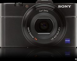
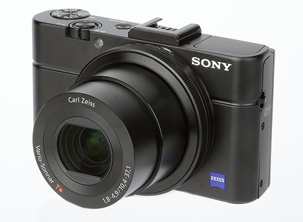
The Sony DSC-RX100M II Cyber-shot digital still camera is a 20.2 Megapixel digital camera. It comes in black and it is a very nice looking camera that has a very ‘high end’ look. One of the main things that the Sony DSC-RX100M II is aimed at achieving is ‘ultra sensitive artistry’. With this digital camera you will be able to capture every exquisite detail with this compact Cyber-shot thanks to extraordinary light sensitivity, image quality that will take your breath away and beautiful background defocusing. This is all due to the newly developed 1.0-inch back-illuminated CMOS sensor and F1.8 lens.
Features
The
key features of the Sony DSC-RX100M II digital camera include a 1-Inch
20.2 MP Exmor R sensor for getting those extreme low-light shots as well
as a 3.6x zoom bright F1.8 Carl Zeiss Vario-Sonnar T lens. Other key
features are an ability to easily connect to smartphones using Wi-Fi or
even NFC and also a new Exmor R® sensor that has the same adaptive noise
reduction technology that is featured on the flagship SLT-A99V.
Additional
features include the PRO Duo™ / Pro-HG Duo™ media Memory Stick, SD,
SDHC and SDXC Memory Card recording media types. The Sony DSC-RX100M II
also features a 3 inch tilt-able LCD that can be titled downwards to 45
degrees as well as upwards to 84 degrees. The 1,229k-dot Xtra Fine
monitor can display scenes extra clearly even under conditions where
there is bright sunlight shining on it. Yet more additional features of
this excellent and award winning digital camera include the ability to
make Full HD movies at 60p/60i/24p. The movie mode also features the
AVCHD™ codec for delivering amazing picture quality.
Additonal Information
Other features include a high speed auto focus which will improve the speed of the focusing as well as the sensitivity as well as ‘Auto Object Framing’ which helps to give your photos a professional look. More features of the Sony DSC-RX100M II digital camera include ‘face detection/registration technology’ which enable the camera to automatically detect up to 8 individual faces and this feature can even prioritise children or adults.
Thing You Need To Consider
The
Sony DSC-RX100M II features Sony’s Exmor R sensor and f/1.8 Carl Zeiss
glass which helps it to capture detail in low light conditions. It also
has a highly sensitive ISO of 12800 as well as Wi-FI sharing. Not to
mention the lightning quick AF which can focus in just 0.13 seconds. It
is already an award-winning camera that has been greatly improved.
One question I get asked again and again is, ‘What is the best graphics tablet?’ as I’m a digital artist, it seems only natural to ask me.
It’s easy to understand why this is perhaps the most frequently asked question to not just me, but every digital artist. The reason for this is because graphic tablets are a unique and confusing technology!
So, the first step to finding the right graphics tablet for you is to understand the technology that’s being offered!
Thank you to Nekoni for her thoughts as an artist on graphics tablets.
First I’ll explain the words that are used
Then look further down, to find out about sizes.
At the end, I’ve recommended the best tablets, in my opinion, depending on various types of artwork.
Important!
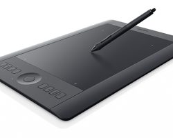
What is a graphics tablet?
The graphics tablet (or ‘digital design tablet’) is an input device (like a mouse, or keyboard) which acts like a giant and highly accurate touchpad, controlled by a stylus (digital pen). It allows artists to draw directly into their graphics programs on PCs, Macs and Laptops.
What can one do?
TRON – speedpainting by SaZo
Pen-specific technobabble:
The language that is used by graphics tablets sellers is very confusing.
Here is a list of the most popular phrases used in relation to the graphics tablet pens and what they actually mean!
“stylus”
The term specific for digital input pens used with graphics-tablets and other hardware. It’s not always used, but is the actual term. (imagine if you were told your new ipad came with a free ‘pen’? Why would you want a pen? Now imagine you were told it came with a free ‘stylus’? Awesome!) “ergonomic pen” “grip pen” “easy to hold pen”
Almost all graphic tablets today come with a comfortable, easy to use variety of stylus (the exact shape and features vary). These don’t affect the quality of your digital artwork, but they do affect how comfortable you are while using them, and there’s no ‘right’ choice. “cord/cable/wired stylus”
Refers to a stylus that is attached to its tablet by a cable. The stylus is therefore slim and light. It’s pretty rare today, as wireless is the standard for most models. “battery operated stylus”
Sends a signal from the pen to your tablet. The stylus needs to be large enough to contain a AAA battery, but is shaped in a way so that it’s narrower at the point at which you hold it. “battery-less stylus”
The tablet powers the stylus via electro-magnetic resonation, which means these styluses are slimmer and lighter than the battery powered alternatives. “tilt sensitivity”, “tiltability” “rotation””tilt recognition”
What most artists are looking for when they chose a stylus with one of these descriptions is a stylus which has a sense of ‘right way up’ and ‘upside-down’ so that it can make more complex digital brush strokes (this is a great feature, especially for painters!). But these terms also may simply mean that the stylus still works when you’re holding it at an angle, (and I’ve never found a stylus that doesn’t). For this stylus it’s best to rely on reviews, as less scrupulous retailers and second-hand sellers who don’t understand the terms can easily use the wrong term, and lead you to disappointment if you don’t know what you’re buying. “levels of pressure sensitivity”
The range of pressure sensitivity starts at 256 levels of pressure, and reaches 3000. 1024 levels of pressure can be registered by most graphics programs, and only the newest and more advanced programs can register anything higher. Levels of pressure sensitivity literally explains how sensitive your pen is, the more sensitive pens will be able to tell the difference between different pressures, but this will only be shown to have an effect if you’re using extremely large brush sizes (upwards of 1000 pixels, in the latest software), or, in some cases, very light pressure (the quality of the pen’s nib and the drawing surface can effect the pressure you need to apply just as much). I suggest 256 and 512 for the beginner or sketcher, 1024 for the student or professional artist, and 2048 or above for the super-professional or any artist who uses a tablet for poster-sized art-work. “Interchangeable right and left-handed pen”
This is one of those marketing oddities, I assume the companies must say this in order to assure left-handed individuals that they too can use graphics tablets… though I’ve yet to find any evidence of a left-handed pen having ever existed.
Tablet-specific technobabble:
So now you know what they’re saying about the pens… how about the tablet themselves.
The tablets are all important and have their own range of specialist phrases.
Here’s a list of the phrases and their meanings.
“programmable hotlinks/ buttons/ scrollers / wheels?”
Most artists find the wheels/scrollers to be useful for controlling the zoom in graphics programs, and for rotating canvas in those that allow it. But neither they nor programmable hotlinks are a actually a required function on any tablet, they’re more of an extra feature that you can use, if you like, to save time. “lines per inch” or “accuracy”
Much like dpi or dots per inch, this is the sensitivity of your graphics tablet and how accurately it recognizes the location of your pen. Unfortunately, not only is this rarely mentioned, but the effect this number has also changes depending on your computer’s settings, and the size of the tablet itself. The end result is that the pen does not follow the path you draw exactly, or makes your lines jagged. The way to avoid this is to read customer reviews, even if a number is given, and bear in mind that the cheapest of these tablets usually come with this disadvantage. For the beginner, or casual artist, or someone who does not intend to use their tablet for fine art, this isn’t much of a problem. It can usually be compensated by working zoomed in, but that has the disadvantage of letting you see less of your artwork at once, and takes longer to draw the same lines. “work area/ live area”
Pay attention to this, a graphics tablet will be described as 10 by 15 inches, but the actual numbers you need to actually pay attention to those of the ‘work’ or ‘live’ areas, the space on which you can draw, which measure much less- say 5 by 8 inches. These numbers are possibly the most important thing when it comes to buying a tablet! What you need to look for is a graphics tablet that matches the size and ratio of your screen as much as possible.
What happens when you buy a tablet that is much smaller than your screen?
It’s very simple, when you draw in real life, say, on a piece of paper, you draw to a scale of 1:1. The motions you make with your hand equal the size of lines you end up with on paper exactly. When you draw on a graphic tablet, these sizes never match completely, but it’s best to get as close to reality as you can.
An example of a size mismatch:
Here is a small tablet and a large screen. You can see the actual line which is input into a tablet, then the line that comes up on screen.
imput: what is drawn in real life. result A mismatched size also has the disadvantage of being less sensitive.
If your tablet is half the size of another tablet, but only has the same level of sensitivity, your small tablet is only half as sensitive. Then add to that the fact your hand is only so accurate, and you are in effect trying to draw, really, really tiny.
If you’ve ever tried to draw a nice picture, but really, really tiny, then you can see the obvious flaw with that. There’s a limit to just how accurately you can control your hands.
There are ways to compensate for a small tablet, as you can simply zoom in until the size matches, or you can set your tablet to only represent a smaller part of your screen.
However, drawing on a smaller part of your screen has obvious flaws…andjust like with a tablet with low accuracy, drawing while zoomed in isn’t a flawless solutution either.
As well as being unable to see what you’re doing in relation to the rest of your artwork, or being unable to edit it quickly, you will end up taking slightly longer and each and every line. Proffesional artists should try to avoid this.
My own screen is actually 18 by 12 inches, and the tablet is smaller (around 12 by 7.5 inches of work area) but it is a much closer match and easier to draw with than my other tablet, which only has 5 x 3.5 inches of work area.
Another thing to take into account is screen ratio. I have a widescreen monitor. And so, I have a widescreen tablet.
Some tablets allow you to set a ratio for you to use, but remember, they can not ‘expand’ the work area outwards if you need a wider area to match your screen; they can only narrow it, vertically. If you anticipate keeping your screen for a long time, and it’s an unusual shape, try and buy accordingly.
In this lens, I want to share some of my earlier project as a photography student. I joined a short course in this field about a year ago. My first assignment was to create a set of photos mainly focus on the close-up face of the subject. I found that it was quite interesting and fun assignment. I spent only about two hours for the photoshoot and another two hours for the editing part.
For this project, I submitted around twenty photos and I decided to share some of them in this article. I remember that my teacher gave me compliment for some of my works. Some of them were even also exhibited in the annual college exhibition. Please let me know your comments and opinions related to my work, as I believe it would help me to take much better pictures in future.
The concept and ideas
As this is one of my earliest assignment in photography class, I was instructed to focus on the technical aspect. My teacher wanted me to learn the basic concept of portrait photography. Thus, he asked all of the student to really pay attention to the focus. The focus must be on the eyes. The composition should be interesting, and we could use any post-processing software that we love.
I decided to create something more surrealist. I decided that for this assignment, there will be only three dominant color: black, white, and red. I was greatly inspired by Natalia Varzina’s works during working on this assignment and somehow she influenced me in a lot of aspects of this photographs.
My teacher told me that there should be at least two different expressions captured in this project. I decided that two of them are confusion and anger. I also experimented with different angles and perspective before finally being able to find the best angle that I wanted to capture. The process of the photoshoot was quite fun. It was considerably quick compared to my other shoot, as it took only about two hours, including the tea break time.
At that time, I was very inexperienced in working with model. I just instructed her to do the basic expressions such as smiling and frowning. During the two hours of work, I managed to capture around one hundred images. Among those, I selected the best twenty and edited in Adobe Lightroom.
The editing process was also quite fun. I was pretty relieved that I got the focus well. I decided to use manual focus, and since it was my first work where I fully used manual focus, I was kinda afraid that the result would be disappointing. As I mentioned before, I only included three major color in the final result of the images. All images should be in black and white, with little addition of red to make it more surrealist.
I submitted the work right after I finished the editing process. Although this assignment was not my best work, I feel pretty happy about them. I managed to get “pass” mark, and my teacher even complimented some of my photos. Somehow, working on this assignment gave me great spirit boost to create better photography works in future.
Some tips
I have several tips that might be useful for you, based on my experience:
Enjoy every moment of your work
This is the first principle that is applicable for any kind of work. In photography, you need to have passion and sincerity towards your concept. You should be able to enjoy every moment you work with your subject. By enjoying your time, you would be able to create some photos that is not only technically good, but also has strong emotional value in it.
Learn from the expert
My teacher told his students that we should spend at least a good one hour per day to take a look at the best works of professional photographers. By doing that, we would be able to learn the technical aspects as well as improving our eyes sensitivity. One most important thing, you should enjoy the learning process so that it has maximum effects in improving your skills.
Manual focus
From this photoshoot, I learned that manual focus works best for portrait photography. It may be difficult to adjust the focus at the first time, but once you are getting used to it, everything would be easier. Manual focus is always better than auto focus, as I believe that human eyes is much better than the artificial focus points in the most expensive camera in the world.
