In Soviet Russia, Posters Post You!
My first real-life exposure to Soviet graphic arts was when my high school art class took a trip to a local museum to see an exhibit of works from the Constructivists. I was both impressed and intimidated by the power of the work I saw there. On the one hand, the visual language is of incredible originality and quality; on the other hand, to see that kind of artistic power in the service of totalitarianism was deeply unsettling.
It was 1990 when I saw that exhibit. Within a year, the USSR had dissolved, ending the Cold War which had defined international politics for almost fifty years. Ironically, the art which called for the death of capitalism became highly influential among artists in the West, going on to have great impact on advertising arts. More ironically, Soviet propaganda art has itself gone on to become a popular commodity. Its imagery remains compelling, eight decades later, even to those who live in “enemy” lands.
Below are some of my favorite Soviet propaganda images. All of them can be obtained from Art.com or AllPosters.com, framed or unframed, in a variety of sizes. They make wonderful learning tools for history, art, or social studies classrooms, a great gift for that graphic arts afficianado on your list, or a wonderful conversation-piece hanging on your dining room wall. With the holiday season upon us, they can also make a wonderful, unusual gift for the art or history lover in your life.
Unfortunately, I don’t read Russian, nor do I understand the Cyrillic alphabet. For translations, I have to rely on the translations provided by the sites where I found the images below. I suspect that some of what I find jarring, or ironic, or comedic in these posters, can be accounted for by this language barrier.
As always, I try to include some information about the image itself, or the artist, or the historical setting, along with my own (sometimes humorous) response. Enjoy!
Russian War Bonds
The Russians Had War Bonds Too
This Russian War Bond poster is from before the revolution. The style of the plane dates from WWI, in which Russia was a co-belligerent. Russia withdrew from the war in 1917, after the abdication of Tsar Nicholas II 1917. The neutral color scheme and illustrative of this poster shows a dramatic contrast with the later, Soviet posters on this page.
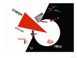
Drive the Red Wedges Into White Troops!
by Lazar Lisitsky
 Drive Red Wedges into White Troops!
Giclee Print Lisitsky,
Lazar 24 in. x 18 in.
Ha! I shall defeat your round white circles by puncturing them with my sharp red triangles!
The white circles in this case represent the anti-Bolshevik “White” factions in the Russian Civil War. Though Lenin had officially seized power in 1917, fighting with counter-revolutionary groups continued until 1923. The “Whites”, who were so named because some of their members wore the white uniforms of Imperial Russia, were a loose confederation of anti-Bolshevik groups. Their ideology ranged from monarchist to bourgeois democrat.
The white circle kind of reminds me of the Rovers in The Prisoner, sent out to retrieve Number 6 every time he thought he’d escaped. If only he’d had a pointy red triangle!
CCCP
… that’s “USSR” in the Roman Alphabet
 CCCP Russian Propaganda P…
Ah, the Union of Soviet Socialist Republics! Where all the children are above average, and the worker-soldiers are fifty stories tall. See how they’re big enough to swat those airplanes out of the sky? And how they’re not doing it, because they’re just that noble?
Consisting of Russia, Ukraine, Moldova, Belarus, Georgia, Armenia, Azerbaijan, Latvia, Lithuania, Estonia, Kyrgyzstan, Uzbekistan, Turkmenistan, Kazakhstan, and Tajikistan, the USSR was one big, happy family that transcended ethnic differences.
Also, it was frighteningly good at ice skating.
Social Cooperation
… It Will Crush You!
 Social Cooperation
Oh, wait … you’re saying that social cooperation is a good thing! That the smaller, human scale workers along the bottom of the image, through their Superpowers of Social Cooperation, can transform into the Mighty Giant Worker that towers over them! Just like Voltron!
Whew! That’s a load off my mind.
Wait. No it’s not.
Soviet Propaganda
also known as “Soviet Art”
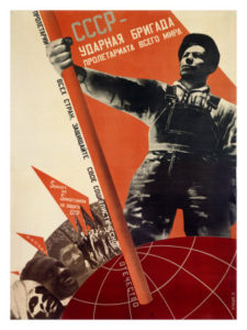 USSR: Udarnaya Brigada Pr… Gustav Klutsis
The bold graphics, simple color scheme, and use of photomontage in this image make it an excellent example of Constructivist art, which was ascendant in the Soviet Union after the Russian Revolution until the early thirties. Artists who were active in the revolution wanted their work to serve the Dictatorship of the Proletariat. These artists saw the Revolution as the perfect opportunity for the avant garde. They would create truly original, forward-looking work, work that was not beholden to art from the bourgeois imperialist past.
I wonder how that worked out for them.
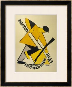
Workers, Keep Your Rifles Within Hand’s Reach!
Vladimir Lebedev
 Workers Keep Your Rifles…
This rather Cubist worker braces a block of wood with one knee as he saws diligently, but his rifle is also close at hand.
Why?
Well, I’m not sure. I wasn’t able to find out any background about this poster, but the style places it in the avant garde. The artist, Vladimir Lebedev, lived from 1891 until 1967, and was active from 1912 onward. According to his wikipedia biographical stub, he “achieved success” in 1920. I’m guessing that this poster is from the early days of the Soviet Union, and stresses the importance of the worker being ever ready to defend the proletariat.
Rumors, Lies, Stories, Talk
They’re bad things, very bad indeed.
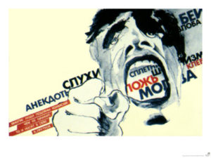 Rumours, Lies, Stories, Talk Giclee Print
24 in. x 18 in.
Perhaps the face in this image belongs to one of those rumor-mongering ghouls that are known to inhabit the sewers of Moscow. Or perhaps it’s the ghost of someone who was killed by lies. Or possibly, it was one of those rare medical cases of someone actually being talked to death.
Lengiz, Books on Every Subject
Aleksandr Rodchenko
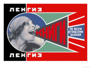 Rodchenko,…
12 in. x 9 in.
In 1924, Rodchenko took a portrait of Lilya Brik and used it in a book store advertisement. It has since become an international icon. Variants have been used as cover art for several music albums. The Dutch punk group The Ex, Mike + The Mechanics, and Franz Ferdinand referenced this image in their cover art. The image continues to be used on posters and brand labels to this day.
There Is Not, Nor Ever Has There Been, A Better Dummy
Aleksandr Rodchenko
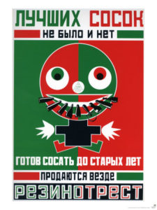
There is Not, and Never Has Been, a Better Dummy, 1923, Giclee Print
Mayakovskii, V….
18 in. x 24 in.
The translation of this one is interesting. Art.com has two versions; one is “Better Pacifiers” and the other is “There Is Not, Nor Ever Has There Been, A Better Dummy”. Dummy? I thought. What does that have to do with pacifiers?
So I called in some friends who have some Russian. One of them thought it was advertising a machine that made “nipples”. Another explained that “dummy” is the British word for “pacifier”, and that some languages would use the world “nipple” in this context. She said that the literal translation was “There never has been and will not be one who sucks so well for many years, who will always sell …” but does not know the important final noun in that sentence. It’s not in her dictionary, but she says it rhymes in Russian.
After still more research, I uncovered a translation here that reads “There’s no dummy like an old sucker.” Heh. Sucker. OK … so it’s some sort of satire, right?
Well, maybe not. A reference on this site refers to a Rodchenko poster for “Baby Dummies”, and translates it as “There are not and have never been any better dummies. They are ready for sucking till you reach old age. Sold Everywhere.” That would imply that it was one of Rodchenko’s advertisements for a state-produced product. Since he was fully behind the Revolution of the Proletariat, he probably would not have meant this satirically (and things might have ended badly for him if he had).
The idea of sucking on a pacifier until I reach old age does not make me want to go out and buy one, but I can certainly imagine it’s funnier in the original. Humor often doesn’t translate.
But what I absolutely do not understand is WHY the image of a mutant psycho baby that seems to be sucking on bullets and grenade pins would make me want to buy a pacifier — much less why it would make me want to actually put that pacifier IN MY BABY’S ACTUAL MOUTH.
Clearly I am missing something here.
Strength Is In Unity!
Um, is that a bad thing or a good thing?
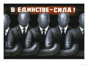 Strength is in Unity! Giclee Print
Lozenko,…
24 in. x 18 in.
There’s something about a row of faceless men in identical suits, their arms links in a chain, that I just find to be creepy. Call me crazy.
I realize, of course, that part of the whole idea behind Soviet propaganda was to subsume the individual in favor of the proletariat. By pooling resources communally, and then sharing them, everyone would be better off than if it was each individual for themselves. Or so the theory went.
But that doesn’t explain the suits and ties. Isn’t that what capitalists wear in the Decadent West?
You Are Now A Free Woman, Help Build Socialism!
Did you hear me? You’re free! So do what I tell you!
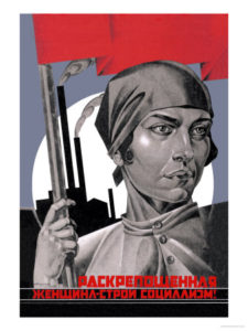
You Are Now a Free Woman, Help Build Socialism! Giclee Print
Strakhov, Adolf
18 in. x 24 in.
Unlike here in the Decadent West, the Communist Revolution imbued Woman with dignity, comradeship, and the right to wear a kerchief. Also, the right to comply with the demand that she help build Socialism. Right. Now.
Who Is the Anti-Semite?
Not the Bolsheviks! Not at all.
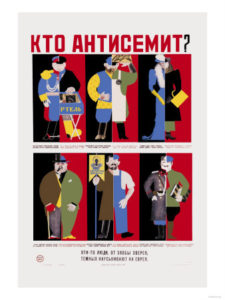
According to the Interwebs, the red and black divisions in this poster represent oppression of Jews under the Tsars, contrasted with opportunities for the Jews under the Bolsheviks.
Pre-revolutionary Russia was notoriously antisemitic. The word “pogrom” is a loan word from Russian, dating from the 19th century Tsarist era, when large-scale anti-Jewish rioting was tacitly condoned by the Russian empire. Jews could not own property and faced restrictions on travel and education. There were also numerous expulsions of Jews from major cities such as Moscow and Kiev. As a result of this oppression, many Jewish Russians were active in the revolution.
In 1919, Vladimir Lenin delivered a speech about the pogroms, framing them in Marxist terms. He stated (and I tend to agree with him) that antisemitism was a convenient way for the upper classes to divert the anger of workers and peasants toward Jewish people and away from themselves. Officially, he condemned antisemitism and all forms of racism, and many high-ranking party members and government officials were of Jewish descent.
Jews nonetheless continued to suffer disproportionately in revolutionary Russia. Jewish artisans and tradesmen lost their autonomy and livelihoods, and the official state ban on religion forbade any religious worship. Life only got worse under Stalin, who persecuted Jewish intellectuals, associating them with “cosmopolitanism”.
One Russian Drinking, Two Russians Fighting, Three Russians Revolution
Dimitri Deeva
 Deeva, Dimitri
18 in. x 24 in.
This image appeals to me because of its simple composition, bold colors, and almost folkloric style. I don’t know if Deeva means to imply that revolution is derived from drunken brawling, or if the committee at the bottom is driving the person at the top to drink. The only thing I know about Deeva is that he is a Russian artist who was born in 1964.
One Israeli Banking, Two Israelis Playing Chess, Three Israelis in Orchestra
Dimitri Deeva, again
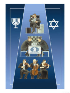 One Israeli Banking, Two Israelis Playing Chess, Three Israelis in Orchestra Giclee Print
Deeva, Dimitri
18 in. x 24 in.
I don’t know quite what to make of this one. On the one hand, there’s the stereotypical (and often antisemitic) trope of the Jewish/Israeli banker. On the other hand, chess and orchestras are nice things that enhance the common weal. Compared to his similar poster regarding drunken, brawling Russians, Israelis come off looking civilized, wouldn’t you say?
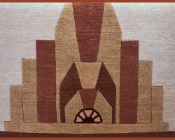
Third Wife
Whose third wife? Is she the third concurrent wife, or the third in a series?
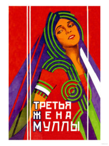 Third Wife Giclee Print
18 in. x 24 in.
I’m guessing that this poster is advertising a play or film, but I’m basing that guess on very little. The style in this image strikes me as very Art Deco. It wouldn’t seem out of place to me in any survey of advertising art from the twenties and thirties.
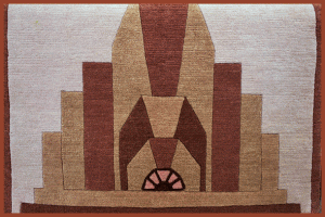
Third Wife
This sheds no light on the subject, I’m afraid.
 Third Wife Giclee Print
18 in. x 24 in.
This poster seems much more in keeping with Constructivist norms than the previous one, with its use of elements like photocollage and “making strange”.
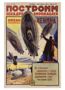
Lenin With Dirigibles
Constructivist Version?
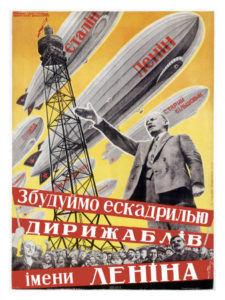 Lenin with Dirigibles
18 in. x 24 in.
There’s no date on this poster, but I can draw a few conclusions from its imagery. First, Lenin emphatically did not want a cult of personality built up around him, which I suspect means that he would not have liked to appear as a giant towering above the masses. That makes me think that this poster dates from after 1922, when Lenin’s failing health sent him into semi-retirement, leaving Josef Stalin has his intermediary with the outside world. Second, since the poster contains Constructivist techniques like photomontage, it probably dates from before 1932, when Stalin imposed the Socialist Realist aesthetic onto Soviet artists.
More Lenin, More Dirigibles
Toward Socialist Realism
 Lenin with Dirigibles
Here’s another image featuring the same subject matter as the previous one: Vladimir Lenin, arm upraised, with dirigibles. Stylistically, however, it differs greatly from the previous image. There is no use of photomontage to play with space and depth, and the construction elements, such as the scaffolding behind Lenin, are downplayed. The dirigibles are presented naturalistically in the sky, above a field with trees and blimp hangars.
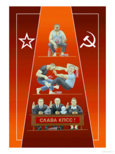
Tajik Soviet Poster
With Lenin and Stalin and Social Realism
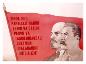
Russian Leaders Giclee Print
Although Constructivism had sought to break free of the artistic past and create completely new art for the revolution, Stalin and others saw it as being tied to “bourgeois” and “decadent” styles like Cubism; there was also concern that the proletariat “couldn’t understand” any art that was not strictly representative. Imagery was simply presented, without nuance, and easy to understand. For instance, you don’t need to understand the slogan to know that this poster extols the virtues of Lenin, Stalin, and Communism, and invites you to rally around their flag.
I wanted to understand the slogan anyway, so I was lucky to dig up a translation. I found out that the poster is in the Tajik language (Tajikistan, you will remember, was one of the Soviet Socialist Republics). The slogan says: “Long Live the great party of Lenin and Stalin – leaders and organisers of building victorious socialism”.
Surprised?
Me neither.
Country and Urban Worker United
United in Socialist Realism.
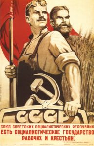
The Republic of Social So…
Leon Trotsky had been the most loyal patron of the Constructivists in the Soviet leadership. When Trostky was pushed out of the party and then into exile by Josef Stalin, many of the Constructivists were branded as “formalists” by the new leadership. In 1932, Socialist Realism became the new, Stalin-approved aesthetic, and artists had to change their style or risk public censure — or worse.
In Capitalist and Socialist Countries
Violinists live very different lives.
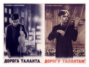 In Capitalist and Socialist Countries
In capitalist countries, artists suffer in poverty. Their clothes don’t fit, their hair is lank and greasy, and they must turn their backs on all that tacky, tacky neon in the back ground.
In Socialist countries, artists enjoy well-fitting clothes and hair that has bounce and body. They get to play in grand concert halls. Those lucky Socialist artists!
In all seriousness, I have to commend the illustrator of this poster. Even though I know full well that it’s propaganda, it still warms my heart to see the young violinist with his thick, healthy head of hair taking his solo in front of the orchestra. The artist was skilled enough to make the violinist’s facial expression realistic and engaging, which just barely saves this poster from being completely maudlin. Just barely.
Socailism, The Vostok Rocket
The Space Race Begins
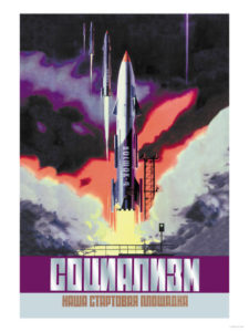
Socialism, The Vostok Rocket Giclee Print
18 in. x 24 in.
The Vostok Rocket launched cosmonaut Yuri Gagarain into low earth orbit on April 12, 1961, making the USSR the first nation in the world to achieve human space flight. The United States would achieve sub-orbital flight a month later, when Alan Shepard went into space for the Mercury project, but would not achieve full orbit until February 1962. The USSR was the first nation to achieve human space flight, to achieve earth orbit, to put a woman in space, and to do extra-vehicular activity.
Worker with Rocket
That’s *MY* Vostok! I built it!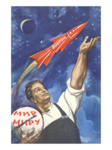
Soviet Worker with Rocket
Here’s a little-known fact about the Vostok rocket. The workforce that built it consisted entirely of young, strapping, blue-eyed workers who proudly gestured to the fruit of their labors every time it streaked across the star-studded sky. Their hair was thick and flowing, yet manly. They were well-muscled and filled out their overalls to perfection. And since no outfit is complete without accessories, at all times they carried with them what looks like a sputnik-model satellite that reads “The World to the World”.
***UPDATE: I have been informed by a commenter that the phrase “mir miry” actually translates as “world peace”. Thanks, internet!


 in 1925.…)