My favorite oil pastel sets from cheap to expensive

My favorite oil pastel sets from cheap to expensive

How to choose your oil pastel set for sketching and serious art work

Oil pastels are one of my favorite painting and drawing medium. Based on my personal experience I want give answers to the question: What is the best oil pastel set to buy or to start with? It depends on the purpose you want to use it for. If you are looking for a set to be given to children you might want to look for a water soluble and more harder oil pastel or wax crayon. Illustrators who mostly do not exhibit their work but store it after scan in a drawer away from light can use a cheaper quality if they prefer a certain brand or set at lower price.

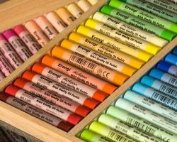
For more ambitious wor the set shown on the image is a portrait set of oil pastels by Sennelier available on amazon.com might be better. It contains those colours best suitable for portrait work i.e. for skin and hair colours. Sennelier is a producer of highest quality oil pastels. Work created with their oil pastels is suitable for long term exposure under normal room daylight, which still contains some of the UV-light that causes colours with less and cheaper pigment load to fade over time.

A fairly good guideline for quality is the price of oil pastels. The competition in this field is very strong especially in the low segment. Therefore you can be sure that a more expensive quality will be the better quality: the sticks last longer, more vibrant colours and better light fastness along with some better properties in handling.

The second reliable criterion is the brand name. Choosing from long established renowned brands will make sure that you get a good quality. That does not say that an unknown brand is not good enough. I try unknown brands on a regular basis if they have colours that seem interesting to me and make a good addition to my sets.

What are the best oil pastels brands

best quality oil pastel brands ,some choices
Of course each artist has his/her own preferences. But when you investigate which brands are used by professional artists or have been used on really stunning art work you most probably will find the same brand names again and again. I do not want to put these brands in a ranking order, it is more about being on that list or not: Sennelier, Holbein, Caran d’Ache, GretaColor for highest qualities and Pentel, Sakura and van Gogh for more price worthy qualities. Most of these brands or companies are known for great colours also in other fields like oil painting or coloured pencil.

The expensive artist oil pastels typically cost around 1-2 $ per small stick, the less expensive ones are very well below 1$ per stick.

Holbein offers an expensive artist oil pastel grade and a less expensive studio quality. Sennelier is famous for their very creamy and pigment rich oil pastels in small and big stick, whereas Caran d’ Ache has developed a range of different grades between soft artist grade named “Neopastel” and less expensive and harder , even water soluble brands named “Neocolor”.

It is possible to use different qualities in the same work, for example a layer of harder pastels as under painting and softer qualities on top.

I have used Caran d’Ache Neocolor for the oil pastel study painting after John Constable’s sketch Dedham lock & mill

Which colours are critical in oil pastel sets ?

Critical colours are those colours that you use more often and in larger quantities than others! The second category of critical colours are those which tend to fade faster than others due to their nature.

1. Colors that you use regularly and which you need in larger quantities

What you need to know before you buy a set is whether colours that are used up can be replaced easily. Is it possible to get that greens you need in spring easily via online order or at your art dealer not to far away? That could limit your choice already quite a bit. Imagine you started a piece and you run out of a certain colour hue. If you need to continue with a different brand your work might not look as good as you wish. I usually need more often natural greens,ochre,all grays and browns, blues and white which are the main colours for landscape work.

2. Which colours are critical due to pigment.

What I have learned from my teachers is that certain colours in pastels as in other colors tend to fade quicker than others due to the nature of the available pigment for those colours. It is commended to use the best quality of colors if possible for work that contain delicate red and pink colour hues. The same applies for orange hues. Therefore artists who specialize on flower still life will pay particular attention to the light fastness of their oil pastels.

The Caran d’Ache oil pastel sets

48 and 96 color sets

Caran d’ Ache 48 color setThese are the sets that I own. The first one is the smaller 48 color set. The colors are ordered in 12 groups of four colors each. This order is very helpful to develop an intuitive understanding of colors and hues, their relations ships and mixing potential. As Plein air painter I appreciated the many shades of green in this selection.

Caran d’ Ache 96 color setThe 96 color set expands the range considerably. There are even two metallic colors, bronze and gold, which are nice to have for special purposes. The consists of two boxes which are stored on top of each other. Cpmpared to the 48 color set the range of greys is large. Also there are very nice hues of “beige”, which I consider warm greys I really appreciate for outdoor painting. In addition to that the range of browns and blues are much bigger.

Thanks for looking .. I hope you will have lots of fun with your new oil pastel set..

How To Use The Color Wheel To Create Outstanding Art

How To Use The Color Wheel To Create Outstanding Art

What Is The Color Wheel And Why Is It Important

How to use the colour wheel in art, in simple terms whilst still being of practical use. There are literally millions of colors as any computer user will tell you but we only need to understand a few of them, and how the colour wheel can help with this, to realise how they can be used together for real benefit to the artist, adding a creative dimension to paintings and other artworks.

The colour wheel only considers three primary colors, three secondary colors and six tertiary colors and we look at how the color wheel is arrived at and how it is used.

The accompanying image is for explanation only and does not represent the actual colours. I put this together in Photoplus and could not obtain the exact colours, the images throughout are taken from this diagram. This should not affect the explanation here.

This will give us a practical ability to select color schemes for our art. For an artist / designer, knowing how to make use of the color wheel makes choosing color schemes and why they work, easy.

This is a concept that beginners sometimes find difficult to grasp at first. However it is very easy and will pay dividends if you understand how to use it to select color schemes for your artwork.

The Color Wheel 101

A Primer

The first thing to understand is that there are three colours from which all others can be mixed. These are called the PRIMARY COLOURS and there are specific names for them but all you really need to know is that they are red, yellow and blue. Please note: I have created the colour wheel images on this page for the purposes of this explanation of the concept, they do not accurately reflect the true primaries or mixes of these.

Photobucket

Mixing these in more or less equal proportion gives another three colours called SECONDARY COLOURS. They are green (blue and yellow), violet (red and blue) and orange (red and yellow).

Photobucket

TERTIARY COLOURS are obtained by mixing a secondary colour with an adjacent primary. E.g. red and orange gives red-orange, blue and violet gives blue-violet.

Photobucket

The real beauty of the colour wheel is not that it provides a colourful diagram, but that it helps to select colour schemes for your artwork and here’s how it fits together

Photobucket

Now we shall consider how we might use this knowledge. But first of all, the colours on the screen do not seem to work too well especially in the red to blue sector. Why not use the paints / colours from your own palette to make a colour wheel? Use it for reference when needed, it will repay the effort many times over. Just start with the primaries and add the other sectors by mixing the colours in the respective proportions. In fact, if you use different primaries ( for example: alizarin crimson in one wheel and cadmium red in another) you will be able to see which colours when mixed give you vibrant greens or dazzling oranges, etc. Knowing how to use your colours is one sign of a good artist.

You can find out more about the primaries I use in my watercolour palette, and how I use them to mix secondaries, etc in my page on Painting The Seasons.

The Monochromatic Colour Scheme

Use Of The Colour Wheel (1)

We can identify five main colour schemes based on their relative positions in the colour wheel. The first and easiest of these is: –

THE MONOCHROMATIC COLOUR SCHEME; contrasts are achieved simply with shades and tints of any one colour.

Now we seem to have introduced the concept of shades and tints. Do not fret! A tint is a lighter version of the colour. It is made by a process which depends on the media being used. In oils or acrylics for instance, it would be a mixture of the pure colour pigment and white. In watercolour, it would be a more dilute mixture of the colour. A shade is a darker version of the colour, often made by mixing with black but could be achieved by mixing in a small amount of the complementary colour. More about this below.

The Complementary Colour Scheme

Use Of The Colour Wheel (2)

The next we shall consider is the complementary colour scheme. Here we make use of one main colour and its close neighbours on the colour wheel or their tints and shades, and add a little zing by also using its complementary colour. This is the colour found opposite on the colour wheel. So :-
for blue the complementary is orange
for red the complementary is green
for yellow the complementary is purple

The photo of the indian lady shows a collage which makes use of a complementary scheme to make the red sash stand out.

Another collage, I have recently completed shows the effect of using a blue colour scheme and adding a little orange in the form of images in a film strip. I think this shows how effective the complementary colour scheme can be.

The Harmonious Colour Scheme

Use Of The Colour Wheel (3)

Next we shall consider the Harmonious colour schem, also called the analogous colour scheme.

This utilises closely co-ordinating colours, i.e. close together on the colour wheel. This is often described as using either warm or cool colours. Warm colours are the reds, yellows, oranges and their mixtures. Cool colours are the blues and greens.

The “sixties” themed ATC shown here uses mainly reds, purples and oranges to give it a warm feel.

Another example is given which uses cool blues in various tints.

The Triadic Colour Scheme

Use Of The Colour Wheel (4)

The triadic colour scheme utilises colours equidistant from each other on the colour wheel. E.g. red-orange, blue-green and blue violet. An example of this is seen in this “african themed” ATC.

This second photo shows also shows a triadic colour scheme in use. The red background with the blue of the repeated advertisements and the yellow text and gold (yellow) colouring dragged across the background.

The Split Complementary Colour Scheme

Use Of The Colour Wheel (5)

painting over collageThe split complementary colour scheme uses one dominant colour balanced by two colours from either side of its complementary. This can be said to be very similar to the triadic scheme and only subtly different.

The example here shows a painting, as I have not been able to find one of my ATC’s that have been created using this colour scheme.

The dominant blue has been off-set with a reddish orange and touches of a yellowish orange.